No-Code Visa Upsells: Where to Place Prompts in Checkout

Visa requirements are one of the fastest ways to turn a high-intent traveler into an anxious one. The moment a customer thinks “Will I be allowed to board?”, your checkout is no longer just a payment flow, it is a trust flow.
That is exactly why no-code visa upsells can work extremely well when they are placed in the right moments, with the right level of urgency, and only when relevant to the itinerary.
This guide breaks down where to place visa prompts in checkout (and where not to), plus the UX patterns and testing plan you can use to increase attach rate while protecting booking conversion.
What “good” looks like for visa upsells in checkout
A visa prompt converts when it feels like part of the trip, not an interruption.
High-performing placements usually share four traits:
- Relevance: shown only when the traveler is likely to need an eVisa, ETA, or other travel authorization.
- Clarity: plain-language copy (avoid immigration jargon unless necessary).
- Low effort: the next step is obvious (and ideally does not require leaving the booking context).
- Trust: security cues, transparent pricing, and clear expectations.
Checkout UX research consistently shows that friction, surprise costs, and uncertainty drive abandonment. If your visa prompt adds any of those, it will underperform, even if the offer is valuable. (See Baymard Institute’s cart and checkout research for broader benchmarks and patterns.)
The 6 best prompt placements in checkout (ranked by impact and safety)
Below are the placements that typically work best for travel brands implementing visa upsells with minimal engineering (widgets, tags, configurable modules, or white-label flows).
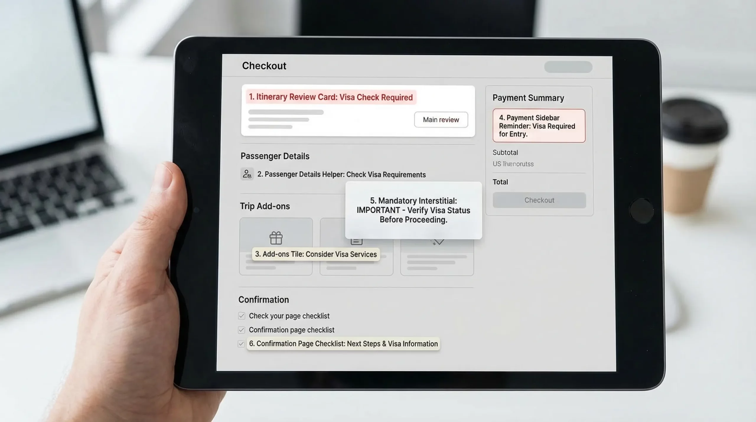
1) Itinerary review page (right after dates and destination are confirmed)
Why it works: you have the strongest “context signal” here (origin, destination, dates). Customers are still in planning mode, so the prompt feels like guidance.
Best for: proactive messaging, low-pressure compliance checks.
Prompt format: a slim inline card near the itinerary summary.
Example copy:
Visa check for your trip to Japan
Most travelers need an entry authorization. Check requirements and apply online.
Button: Check visa requirements
Guardrail: do not show this to everyone. Only trigger when your rules indicate “required” or “recommended” based on itinerary and traveler nationality (or when nationality is unknown, invite them to check).
2) Passenger details step (passport and traveler info moment)
Why it works: the customer is already entering identity data, so the mental model matches “travel documents.” It also reduces duplicated data entry if you can pass fields into the visa flow.
Best for: higher intent users, fewer irrelevant impressions.
Prompt format: contextual module right under passport fields, or a “Need a visa?” helper link.
Example copy:
Need an eVisa for this itinerary?
Apply now so you do not risk issues at check-in.
Button: Start eVisa application
Guardrail: keep it visually secondary. The primary task is completing passenger details, so avoid large modals unless the visa is truly mandatory for boarding.
3) Add-ons page (the natural upsell shelf)
Why it works: customers expect extras here, and your merchandising logic is already present.
Best for: bundling with insurance, seats, bags, fast track.
Prompt format: standard add-on tile with price transparency.
Example copy:
eVisa application assistance
Guided application and status tracking for your destination.
Toggle: Add to trip
Guardrail: avoid burying it among unrelated ancillaries. If you have many add-ons, consider pinning “Travel documents” as its own mini-category.
4) Payment step sidebar (last-chance, low-disruption reminder)
Why it works: the traveler is highly committed. A small reminder can catch people who missed earlier prompts.
Best for: capturing late deciders without derailing payment.
Prompt format: compact sidebar card next to order summary.
A useful reference is any clean, high-trust checkout that uses an order summary column and security cues, for example the Vitals Vault Checkout. The product is different, but the layout principle is the same: keep the primary action obvious, and keep secondary actions contained.
Example copy:
Travel document reminder
You may need an entry authorization for this trip.
Link: Check in 60 seconds
Guardrail: do not add extra required fields on the payment page. Payment is a fragile step.
5) “Confirm and pay” interstitial (only for truly mandatory cases)
Why it works: if a traveler will likely be denied boarding without an authorization, an interstitial can prevent downstream disruption and chargebacks.
Best for: high-risk routes, high operational cost of non-compliance.
Prompt format: blocking modal with two clear options.
Example copy:
Important: travel authorization likely required
Continue if you will apply later, or apply now to stay on track.
Buttons: Apply now, I will do this later
Guardrail: use sparingly, and only when confidence is high. If you block users incorrectly, you will lose bookings.
6) Confirmation page (post-payment “next steps” checklist)
Why it works: the booking is secured, so upsell pressure drops. The traveler is now receptive to a checklist that reduces anxiety.
Best for: high completion rates, lower conversion risk.
Prompt format: a “Next steps for your trip” section.
Example copy:
Next step: confirm entry requirements
Start your visa application now, or save this for later.
Buttons: Start now, Email me a link
Guardrail: make it easy to resume later. Many travelers are done once they see a confirmation number.
What each prompt should contain (a simple spec your team can reuse)
Use the same core structure everywhere so your UX stays consistent.
| Component | Why it matters | Recommended default |
|---|---|---|
| Destination-specific headline | Increases relevance and CTR | “Visa check for your trip to {Country}” |
| One-sentence value | Prevents confusion | “Guided online application and document checklist.” |
| Primary CTA | Drives action | “Check requirements” or “Start application” |
| Time and effort expectation | Reduces fear of a long form | “Takes only a few minutes to begin” (keep it conservative) |
| Trust signal | Reduces payment anxiety | “Secure online processing” plus recognizable support language |
| Deferral path | Protects checkout conversion | “Do this later” or “Email me a link” |
No-code implementation patterns (how to launch without engineering)
“No-code” can mean different things depending on your stack (OTA platform, airline booking engine, headless checkout, or a custom flow). In practice, the fastest teams pick one of these patterns:
Embedded module (inline card)
- Best for itinerary review, add-ons, and confirmation pages.
- Lowest disruption.
- Easy to A/B test.
Lightbox or slide-over (modal)
- Best for mandatory or high-confidence prompts.
- Higher risk if triggered too often.
Deep link to a white-label visa flow
- Best when you want to keep checkout stable but still monetize.
- Works well if you can pass trip context (destination, dates, booking reference) so users do not retype information.
Post-booking “manage trip” entry point
- Best for customers who want to pay first and handle admin later.
- Often pairs well with email and SMS reminders.
If you are using SimpleVisa, these patterns typically map to either an in-flow integration, a white-label visa application app, or custom data services that power conditional prompts based on border requirements.
A/B tests that reliably improve attach rate (without harming bookings)
Instead of testing “prompt vs no prompt,” start by testing placement and friction. These are safer, and they usually produce clearer wins.
| Test | Variant A | Variant B | Primary metric | Watch-outs |
|---|---|---|---|---|
| Placement | Add-ons tile | Passenger-details helper | Visa attach rate | Checkout completion rate |
| CTA wording | “Check requirements” | “Start application” | CTR to visa flow | Downstream completion |
| Price visibility | Show “from $X” | Hide price until next step | Attach rate | Surprise-cost abandonment |
| Deferral option | None | “Do this later” link | Checkout completion | Visa conversion may drop |
| Trust microcopy | Generic | Security + support line | CTR and payment completion | Keep copy short |
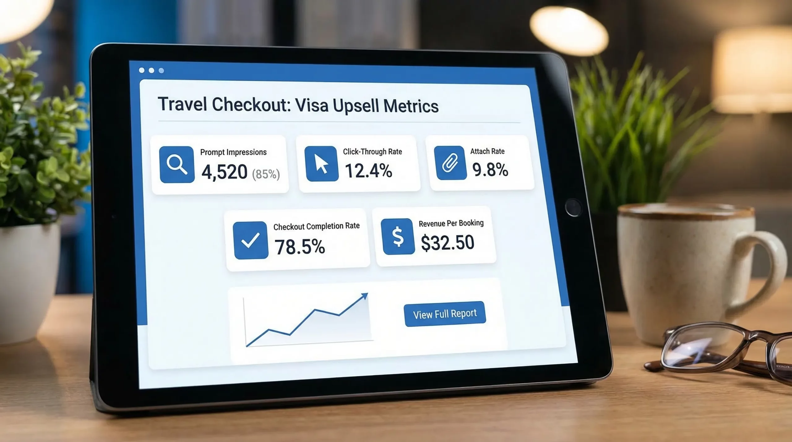
Implementation note: whichever placement you choose, measure it with events, not just revenue. You want to know where users click, where they drop, and where they resume.
Common mistakes that kill checkout performance
Most underperforming visa upsells fail for predictable reasons:
- Prompting too early, before the destination or dates are confirmed.
- Prompting everyone, including visa-free travelers.
- Using vague copy like “Get a visa” when the traveler actually needs an ETA, eVisa, or may be exempt.
- Creating a new tab experience that feels like leaving the booking and increases anxiety.
- Hiding total cost until late in the flow.
- Asking for too much too soon (document uploads before the user even understands eligibility).
If your travelers abandon long forms, it is usually not because they do not want the visa, it is because the UI made it feel risky or time-consuming. For form-level UX fixes, you can also reference SimpleVisa’s guidance on why travelers abandon visa forms and UX fixes that convert.
A practical 30-day rollout plan (minimal risk)
Week 1: Launch the safest placements
Start with:
- Itinerary review card (contextual, low friction)
- Confirmation page checklist (conversion-safe)
Week 2: Add conditional logic
Improve relevance by triggering prompts only when:
- Destination is known
- Travel window is known
- Nationality is known (or prompt becomes “check requirements”)
Week 3: Introduce one high-intent placement
Add the passenger details helper. This tends to capture travelers who are serious about compliance.
Week 4: Test add-ons and payment sidebar
Add one merchandising placement (add-ons tile) and one reminder placement (payment sidebar), then keep the winner.
If you want a more implementation-oriented walkthrough, SimpleVisa has a step-by-step guide on embedding an eVisa widget and broader templates for building a post-booking visa journey.
Frequently Asked Questions
Do visa upsells hurt checkout conversion? They can, if they are irrelevant, too aggressive, or add steps at payment. In most cases, starting with itinerary review and confirmation-page prompts protects conversion while proving demand.
What is the single best place to put a visa prompt in checkout? For most travel brands, the itinerary review page performs best because it is highly contextual and still early enough to influence trip planning.
Should I show visa prompts before I know the traveler’s nationality? Yes, but phrase it as a low-commitment check (for example “Check requirements”). Once nationality is known, you can switch to a more direct “Start application” prompt.
Should visa be an add-on or a required step? Treat it as an add-on unless you have very high confidence it is mandatory for boarding. Blocking interstitials are powerful but risky if misapplied.
What metrics should I track for visa prompts? At minimum: prompt impressions, CTR, start rate, application completion rate, attach rate per booking, ancillary revenue per booking, and any change in checkout completion.
Make visa upsells feel like traveler support (and monetize them)
If you want to launch visa upsells quickly without heavy engineering, SimpleVisa is designed to help travel businesses add guided visa applications, online visa processing automation, and no-code implementation options that fit directly into booking flows or a white-label experience.
Explore options at SimpleVisa and choose the integration model that matches your checkout, whether that is an embedded flow, a white-label app, or an API-driven approach for deeper customization.