Visa Requirement Badges: UX Patterns That Increase Attach Rate

Visa questions are the silent conversion killer in travel commerce. When a traveler is not sure whether they can enter a destination, they hesitate, abandon the booking, or push the problem to your support team. The simplest fix is often not another FAQ page, it is a small UI element placed at the right moment: a visa requirement badge.
Badges work because they turn “I’m not sure” into “I know what to do next” without forcing a detour. Done well, they increase attach rate for eVisas and travel authorizations, reduce anxiety, and help your brand look more trustworthy and proactive.
What a “visa requirement badge” really is
A visa requirement badge is a compact status label that communicates entry requirements in-context, typically next to a destination, itinerary, or passenger details.
Unlike a generic banner (“Don’t forget your travel documents”), a badge is:
- Specific (visa-free vs eVisa vs ETA vs embassy visa)
- Actionable (it implies a next step)
- Scannable (works in lists and on mobile)
- Personalizable (can change based on passport, dates, itinerary)
Common examples:
- “Visa required”
- “Visa-free”
- “ETA required (online)”
- “eVisa available”
- “Check requirements” (when details are missing)
The key is that the badge is not just information, it is choice architecture for your ancillary offer.
Why badges increase attach rate (the UX mechanics)
Visa products attach when travelers feel three things: clarity, urgency, and trust.
1) Clarity reduces cognitive load
If entry requirements are hidden in a long article or buried behind a link, travelers must remember to check them (and many will not). Badges support “recognition rather than recall,” a core usability principle in the Nielsen Norman Group heuristics.
2) Badges create “just-in-time” urgency
A traveler’s motivation peaks while they are committing to an itinerary. Badges surface the requirement at the moment the traveler is mentally saying, “Yes, I’m going there.” That timing is hard to replicate with post-booking emails alone.
3) Trust rises when you look prepared
A crisp badge with clear language and a transparent source (“based on your passport and dates”) signals competence. It is also a gentle way to set expectations: requirements vary and can change.
If you have seen high abandonment on visa forms, badges are the upstream fix: they reduce surprises before a traveler hits an application flow. (Related: Why Travelers Abandon Visa Forms—and 6 UX Fixes That Convert)
The anatomy of a high-converting visa badge
A badge needs to do two jobs at once: communicate status and guide action.
Badge microcopy: say what it is and what to do
Avoid vague labels that sound like warnings. Prefer labels that combine requirement + path.
| Goal | Weak badge text | Better badge text |
|---|---|---|
| Reduce uncertainty | “Travel docs” | “Visa required” |
| Keep it actionable | “Visa info” | “Check visa requirements” |
| Indicate digital path | “Permit needed” | “ETA required (online)” |
| Make the upsell feel helpful | “Apply now” | “eVisa available” |
Color and iconography: don’t rely on color alone
A common mistake is making “Visa required” red and “Visa-free” green with no icon or text differentiation. Keep accessibility in mind.
Good patterns:
- Pair color with an icon (checkmark, info, alert) and plain text.
- Use neutral “info” styling for “Check requirements,” not an error state.
- Reserve “warning” styling for truly time-sensitive or high-risk cases (for example, “Visa required, processing time may exceed travel date”).
Always include a fallback state
In real booking flows you often lack key inputs (passport, resident status, transit details). A conversion-friendly badge system handles uncertainty without breaking trust.
A practical 3-state model:
| State | When to show | What it should do |
|---|---|---|
| Confirmed | Passport and itinerary details are known | Display requirement clearly and offer next step |
| Provisional | Some details known, but not enough to confirm | Ask for missing inputs (“Select passport to confirm”) |
| Unknown | Details missing or rules too complex to decide inline | Offer “Check requirements” and open a guided checker |
Placement patterns across the funnel (and what each one is best for)
Badges perform differently depending on where you place them. The goal is to increase attach rate without overwhelming the primary booking task.
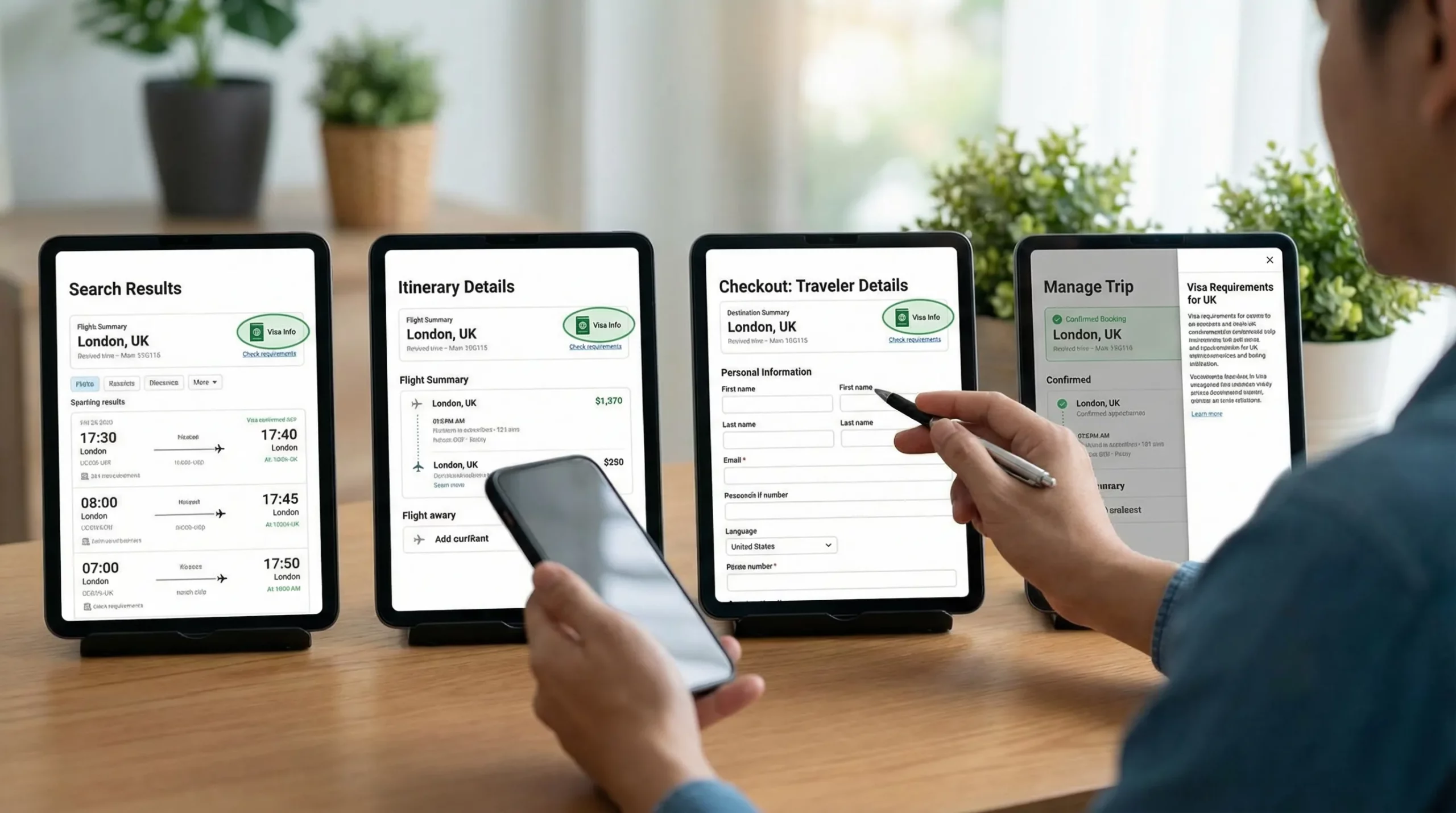
Search results and destination listings: optimize for scanning
Best for: Early expectation-setting and reducing “research detours.”
Pattern:
- Show a compact badge near the destination name.
- If personalization is impossible here, use “Check requirements” instead of guessing.
What to avoid:
- Overly specific claims without passport context (“Visa-free” for everyone).
- Long copy that breaks list density.
Itinerary details (flight/hotel page): optimize for intent
Best for: Turning interest into action.
Pattern:
- Badge + short clarifier: “Based on US passport” or “Select passport to confirm.”
- A “Learn what you need” interaction (tooltip, side sheet, or modal).
This is a strong moment to introduce an embedded visa solution because the traveler is still choosing.
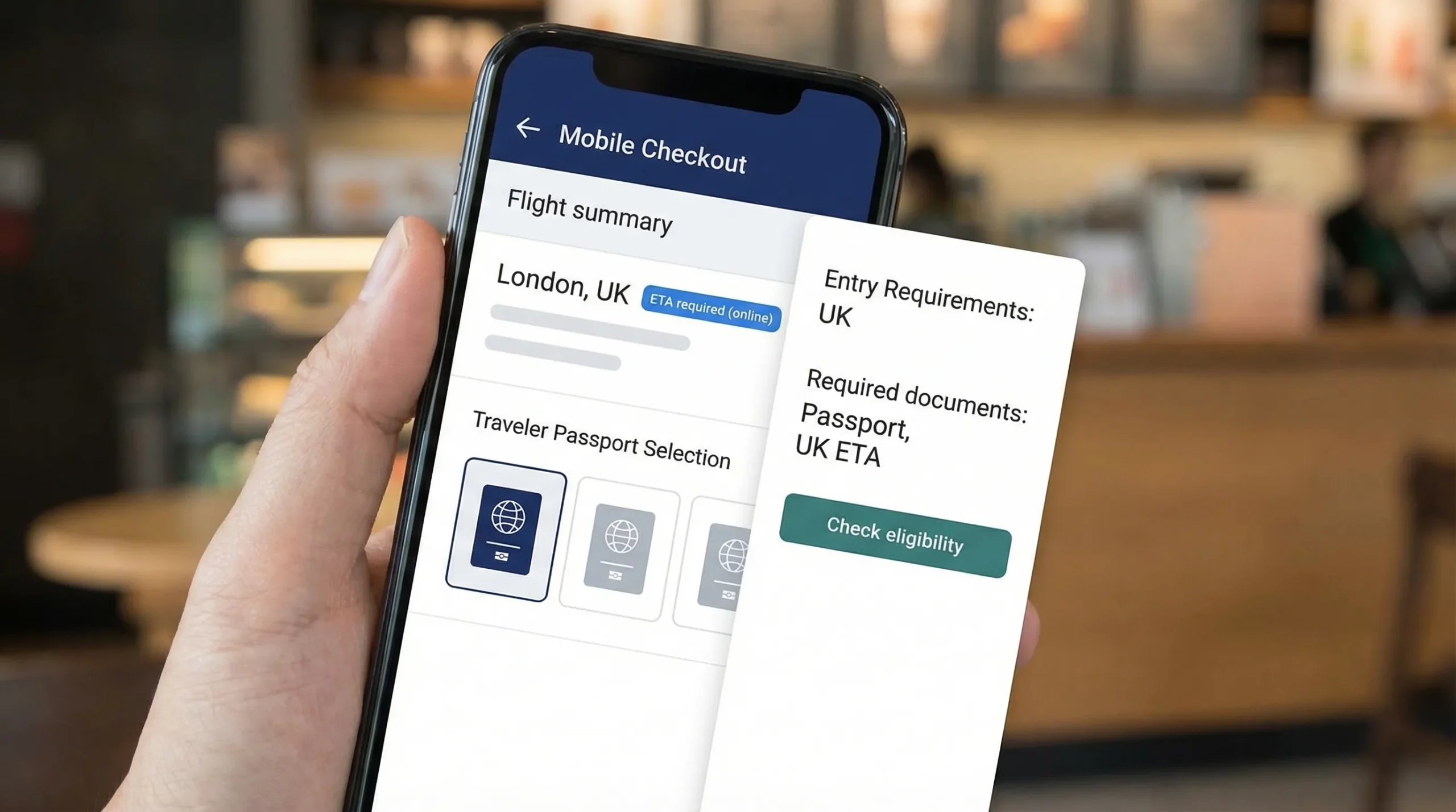
Checkout or traveler details: optimize for completion
Best for: Conversion to visa add-on without harming checkout completion.
Pattern:
- Place the badge close to passenger nationality/passport inputs.
- Use progressive disclosure: show “Visa required” after passport is selected.
- Keep the interaction lightweight (side sheet beats a full page redirect).
What to avoid:
- “Hard stops” that block checkout unless it is truly necessary.
- Fear-based copy (“You will be denied boarding”) as a default message.
Post-booking (manage trip): optimize for rescue and compliance
Best for: Capturing late attach and reducing no-shows/denied boarding risk.
Pattern:
- Show badges inside the trip timeline: “Action required: ETA” or “eVisa recommended.”
- Combine with reminders that match travel dates.
This channel is especially useful when travelers booked quickly and intend to handle paperwork later.
For a broader orchestration blueprint, see Building a Seamless Post-Booking Visa Journey: Tools & Templates.
Personalization: where badge strategies usually fail
A badge that is not personalized will either be wrong (worst case) or overly cautious (conversion leak).
Visa requirements depend on more than the destination. Common variables include:
- Traveler passport nationality (and sometimes residency)
- Entry type (tourism, business, transit)
- Length of stay
- Travel dates (policy changes happen)
- Transit and stopovers
- One-way vs return (proof of onward travel)
A robust UX pattern is to ask for the minimum input needed to confirm.
| Missing input | High-converting badge behavior | Why it works |
|---|---|---|
| Passport nationality unknown | “Check requirements” + “Select passport to confirm” | Turns uncertainty into a micro-task |
| Multiple passengers | “Requirements may vary by passenger” | Avoids overpromising |
| Transit included | “Transit rules may apply” with “View details” | Prevents surprise at the airport |
| Policy may change | “Rules can change. Confirm before travel.” | Builds trust without alarmism |
If your product team needs a reference baseline for “what varies by country,” keep an internal link handy to a structured guide like Visa Requirements by Country: A Quick Reference.
Interaction patterns that convert without feeling aggressive
The goal is to make the visa add-on feel like assistance, not a hard sell.
Use a side sheet (or inline expansion) instead of a redirect
A side sheet can show:
- Requirement summary
- Estimated steps (high level)
- Documents likely needed
- CTA: “Start visa application” or “Check eligibility”
This keeps travelers anchored in the booking flow.
Include a “why” line for credibility
A single line like “Based on your passport and travel dates” reduces skepticism.
If you cite a data source, be transparent. Many travel companies rely on IATA’s Timatic database for entry requirements. You can reference it as an industry standard and link for context (for example, IATA Timatic).
Show the next step, not the entire rulebook
Badges should not attempt to teach immigration law. They should:
- Confirm a category (visa-free, eVisa, ETA, consular)
- Offer the path (apply online, check eligibility)
- Provide exceptions only when high impact (for example, “Visa-free up to 30 days”)
If you want deeper education, keep it one click away.
Measuring impact: how to prove badges increased attach rate
Treat badges as a measurable growth surface, not a cosmetic change.
Events to instrument
| Event | What it tells you | Related KPI |
|---|---|---|
| Badge impression | Exposure volume | Reach by funnel step |
| Badge click (open details) | Intent and curiosity | Badge CTR |
| Eligibility check started | Qualified traffic | Assisted conversion rate |
| Visa application started | Monetizable intent | Attach funnel entry |
| Application completed | End-to-end success | Attach rate, completion rate |
| Support contact after badge view | Clarity issues | Deflection rate |
A/B tests that work well
Instead of testing “badge vs no badge” only, test the parts that change behavior:
- Copy: “Visa required” vs “eVisa available” (when true)
- Interaction: tooltip vs side sheet
- Personalization prompt: “Select passport to confirm” placement
- Timing: show at itinerary vs at checkout
If you already track visa-related business outcomes, align these tests with your broader reporting approach. (Related: 5 KPIs to Track After Deploying a Visa Management Platform)
Implementation options (and how teams usually roll it out)
From a delivery perspective, most travel brands implement visa requirement badges through one of three models:
- API integration for deep embedding and full UX control
- White-label visa application app for fast launch with a branded experience
- No-code implementation or widget-style embedding for speed and limited engineering bandwidth
If you are weighing integration paths, this comparison can help: API vs. White-Label App: Which Visa Integration Model Suits You?. And if you want a practical example of embedding quickly, see Quick Tutorial: Embedding an eVisa Widget in Under 30 Minutes.
A rollout checklist for product and UX teams
| Step | Output | Common pitfall |
|---|---|---|
| Map badge touchpoints | A simple funnel map | Spreading badges everywhere at once |
| Define badge taxonomy | Allowed labels and states | Too many variants users cannot learn |
| Align on logic inputs | Passport, dates, transit rules | Overclaiming without enough data |
| Design the interaction | Side sheet, modal, inline | Forcing a redirect during checkout |
| Instrument analytics | Events and dashboards | Measuring only revenue, not intent |
| QA edge cases | Multi-passenger, transit | Incorrect “visa-free” claims |
Frequently Asked Questions
Do visa requirement badges work without passport personalization? They can still reduce uncertainty if you use an honest fallback like “Check requirements,” but the biggest conversion gains typically come after you confirm requirements based on passport and itinerary inputs.
Where should we place the first badge in the funnel? Start where intent is high and inputs are available, usually the itinerary details page or checkout traveler details. Search results can work too, but keep the badge non-committal unless you know the traveler passport.
What’s the safest microcopy when we are not 100% sure about the rule? Use “Check requirements” or “Select passport to confirm.” Avoid definitive labels like “Visa-free” unless your rules engine has sufficient inputs to support it.
How do we prevent badges from hurting checkout conversion? Use progressive disclosure and light interactions (side sheets). Keep checkout focused on payment, and position the visa CTA as optional help unless compliance requires a hard stop.
Should badges link to a long content page or an embedded flow? For attach rate, embedded flows generally perform better because they preserve momentum. Long content pages are better for education and SEO, but they add steps.
How do we handle complex itineraries with transit and multiple destinations? Show per-leg badges where possible and add a clear note like “Transit rules may apply.” Provide a guided checker that asks for the missing details instead of guessing.
Turn visa requirements into a helpful, high-converting add-on
If you want visa requirement badges that are accurate, personalized, and easy to integrate, SimpleVisa can help you surface entry requirements inside your booking flow and guide customers through online visa processing.
Explore how SimpleVisa supports travel brands with visa processing automation, API integration, white-label visa application experiences, and no-code implementation options at SimpleVisa. If you are ready to discuss a badge-first rollout that improves attach rate and reduces support load, request a demo through the site.