eVisa Checkout UX Tips That Improve Conversion
An eVisa offer in checkout has a difficult job. It must feel helpful, not interruptive. It must ask for sensitive traveler information, but still feel safe. And it must convert as an ancillary product without slowing down the core booking.
That balance is what makes eVisa checkout UX so important for airlines, OTAs, cruise lines, tour operators, TMCs, and travel marketplaces. A well-designed flow can help travelers avoid border problems, reduce support demand, and create a new source of ancillary revenue. A poorly designed one can create hesitation at the exact moment a customer is ready to pay.
Checkout is already fragile. Baymard Institute research has consistently shown that online cart abandonment averages close to 70%, with friction such as unexpected costs, long processes, and lack of trust among the recurring causes. Visa requirements amplify those concerns because the traveler is not just buying an add-on. They are making a compliance decision that affects whether they can board or enter a destination.
The goal is not to push every traveler into an eVisa application. The goal is to identify who needs travel authorization, explain why it matters, and make the next step feel simple, secure, and timely.
What conversion means in an eVisa checkout flow
Before changing the interface, define the conversion you want to improve. For eVisa services, the funnel is more nuanced than a single click on an upsell card.
A traveler might accept the eVisa prompt, start the application, upload documents, pay the service fee, receive approval, and still need reminders before departure. Each stage has its own UX risks and metrics.
| Checkout stage | Traveler question | Main UX risk | Conversion metric to track |
|---|---|---|---|
| Eligibility check | Do I need a visa or travel authorization? | Generic or inaccurate messaging | Eligible travelers identified |
| Offer decision | Should I handle this now? | Unclear value, timing, or price | eVisa attach rate |
| Application start | How much effort will this take? | Long forms inside checkout | Application start rate |
| Document capture | Are my documents acceptable? | Upload errors and mobile friction | Document completion rate |
| Payment | What am I paying for? | Hidden fees or payment confusion | Paid application rate |
| Post-submit status | What happens next? | Anxiety and support tickets | Status views, approvals, CSAT |
This matters because an eVisa checkout can appear successful if many travelers click the prompt, but still fail commercially if they abandon during document upload or contact support after payment.
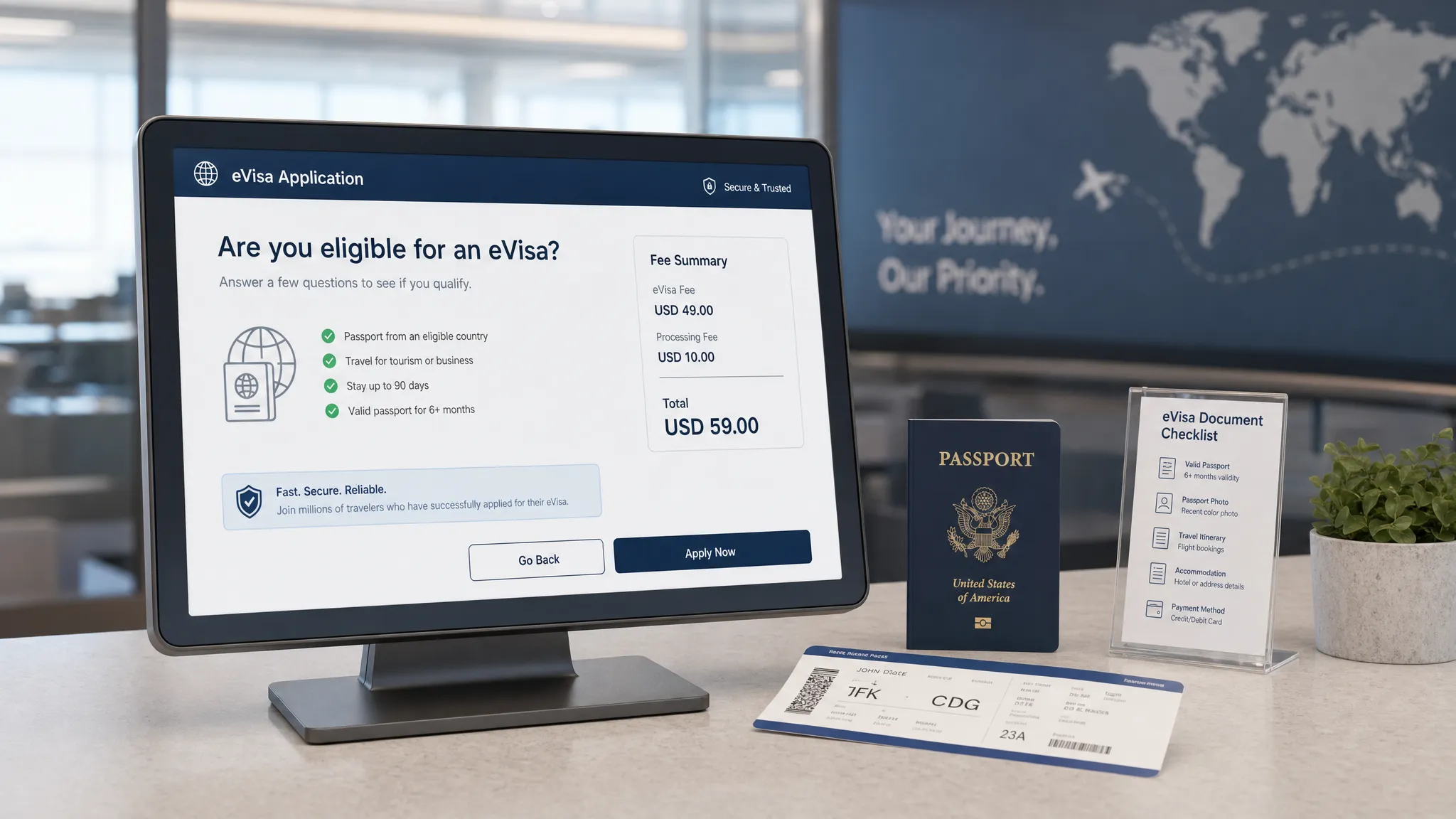
Tip 1: Trigger eligibility before the payment cliff
The best eVisa checkout experiences do not wait until the confirmation email. They check eligibility while the traveler is still actively building the trip, ideally before final payment.
At minimum, eligibility logic should use destination, nationality or passport country, departure date, stay duration, and transit points when relevant. If nationality is not yet known, ask one lightweight question instead of displaying a generic banner to everyone.
A strong prompt might say: “Based on your passport and destination, you may need an electronic travel authorization before departure.” A weak prompt says: “Need a visa? Click here.” The first is contextual. The second forces the traveler to do the research.
This is where a travel API can make a major difference. Instead of sending users to static help pages, travel brands can surface rules inside the booking path. If you want a technical breakdown, SimpleVisa explains the process in How eVisa APIs work: Step by Step.
Just as important, the system should also say when no visa action is required. Telling a traveler “No eVisa required for this itinerary” builds trust and makes future prompts more credible.
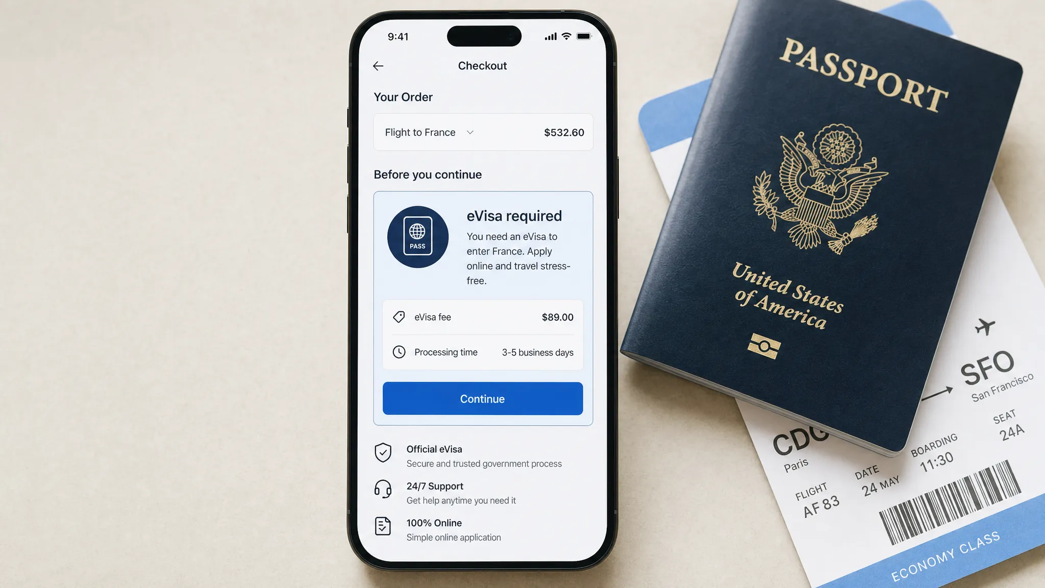
Tip 2: Position the eVisa as trip readiness, not a random add-on
Travelers are used to being offered baggage, seats, insurance, transfers, and loyalty upgrades during checkout. An eVisa is different. It is tied to entry eligibility, not comfort or preference.
That means the UX copy should frame the product around readiness and risk reduction. Avoid language that makes the eVisa sound like a discretionary accessory if it is actually required or strongly recommended for that itinerary.
| Weak checkout copy | Better checkout copy |
|---|---|
| Add an eVisa | Complete your required travel authorization online |
| Get a visa fast | Apply before departure and leave time for corrections |
| Don’t forget travel docs | Your passport and destination may require an eVisa |
| Continue to visa service | Check requirements and start your guided application |
| Visa from $X | View total price, processing time, and required documents |
Good copy does three things quickly. It explains relevance, reduces uncertainty, and tells the traveler what happens after the click.
Be careful with urgency. It is acceptable to show real deadlines, such as “Apply at least 72 hours before departure” when that guidance is accurate for the destination. It is not acceptable to manufacture pressure with vague countdowns or fear-based copy.
Tip 3: Keep heavy application tasks out of the core payment path
A common checkout mistake is trying to complete the entire visa application before the traveler pays for the trip. That can work for simple authorizations, but it becomes risky when the application requires passport scans, employer details, accommodation proof, or multiple traveler documents.
The core booking path should stay focused. If the eVisa process is short, you can keep it embedded. If it is longer, use checkout to confirm eligibility, capture intent, and route the traveler into a guided post-booking application.
A practical pattern is to offer a clear choice: start now or continue after booking. The first option helps travelers who are close to departure. The second protects booking conversion when the trip purchase is still the primary goal.
This is not about hiding complexity. It is about sequencing it. If a visa must be approved before ticketing or travel, the interface should state that clearly. If the traveler can complete the application after booking, the UX should preserve momentum and provide a reliable follow-up path.
For form-level improvements, SimpleVisa has a dedicated guide on why travelers abandon visa forms and how to fix them. In checkout, the key question is even sharper: what is the smallest amount of information you need right now to move the traveler forward safely?
Tip 4: Show total cost, timing, and refund rules before commitment
Unexpected costs are one of the fastest ways to break checkout trust. eVisa pricing can include government fees, service fees, optional priority handling, currency conversion, and in some cases non-refundable charges.
Do not reveal those details only after the traveler has entered passport information. A high-converting eVisa checkout should show a clear price summary before the application begins.
The same applies to timing. “Fast processing” is less useful than a realistic processing window and a note that applications may require additional review. Travel rules vary by country, nationality, and purpose of travel, so avoid overpromising.
A strong price and timing module should include:
- Government fee and service fee when both apply
- Currency and accepted payment methods
- Estimated processing time or recommended application window
- Refund policy for service fees and government fees
- What happens if the traveler is not eligible or needs a different visa type
If your travel brand is exploring fee presentation in more depth, see SimpleVisa’s guide on how visa costs are calculated.
Tip 5: Design document capture for mobile behavior
Many travelers book on mobile. Yet many visa flows still behave like desktop forms with tiny upload controls and unclear image requirements.
Mobile document capture should feel native. Let travelers use the camera, upload from files, or select from a photo library. Show examples of acceptable passport scans and photos. Validate image quality as early as possible, especially for glare, cropping, blur, file size, and expired passports.
The upload step is also where accessibility matters. Large tap targets, visible labels, keyboard-friendly form fields, high contrast, and clear error messages are not just good practice. They reduce abandonment for everyone. The WCAG 2.2 guidelines provide a useful baseline for accessible digital experiences.
Microcopy is especially important here. “Upload passport” is not enough. “Upload the photo page of your passport. Make sure all four corners are visible” prevents errors before they happen.
Tip 6: Use prefill, but never at the expense of accuracy
Prefill is one of the highest-impact UX improvements in travel document automation. Booking flows already collect names, dates of birth, passport details, contact information, trip dates, and accommodation data. Reusing that information can reduce typing, shorten forms, and prevent inconsistencies.
But visa applications are unforgiving. If the traveler’s ticket name, passport name, and application name do not match, the consequences can include delays, correction fees, or refusal.
The best pattern is assisted prefill. Populate fields where the source data is reliable, then ask the traveler to confirm against the passport. If the passport scan or MRZ reveals a mismatch, show a specific warning before submission.
Avoid silent corrections. Travelers should understand when the system changes capitalization, removes special characters, or reformats dates. Visa UX should feel efficient, but never mysterious.
Tip 7: Add trust signals at the exact moment anxiety rises
An eVisa checkout asks for sensitive information, including passport data, personal details, travel plans, and payment information. Trust signals should appear where the anxiety happens, not just in a footer.
When the traveler is asked to upload a passport, explain why it is needed. When they pay, explain what fee is being charged. When they submit, explain who reviews the application and how status updates will be delivered.
Useful trust elements include privacy notices, secure payment indicators, refund policy links, customer support access, and a concise explanation of data handling. For payment environments, standards such as PCI DSS are an important reference point for protecting cardholder data.
Travel brands should also avoid overloading the interface with generic badges. Trust is built through specificity. “We use your passport details to check destination entry requirements” is more reassuring than a vague “100% secure” label.
Tip 8: Localize more than the language
Localization is not just translation. eVisa checkout UX should adapt to the traveler’s market, device, currency, and document conventions.
For example, travelers may expect different date formats, address structures, phone number formats, name order, and payment methods. A form that works well for a U.S. traveler may create confusion for a traveler from Japan, Brazil, India, or the Gulf region.
Localizing currency is particularly important when the eVisa is sold as an ancillary service. If the booking is priced in U.S. dollars but the visa fee appears in another currency with no explanation, the traveler may pause to compare prices or contact support.
Rules must also be localized by passport, not just location. A traveler booking a flight from Paris to Bangkok may hold a Canadian, Indian, or Brazilian passport. The checkout experience should not assume nationality based on departure city or IP address.
Tip 9: Build exception handling into the happy path
Visa flows fail when they are designed only for the simplest traveler. Real travel groups include minors, dual citizens, passport renewals, name changes, mixed nationalities, last-minute departures, and transit stops.
You do not need to show every exception upfront. That would overwhelm the checkout. But the experience should make it easy to handle common cases without sending the traveler to a generic support page.
For example, if the booking includes four passengers with different passports, show visa requirements per traveler. If a passport expires too soon, flag it before payment. If a traveler selects business travel instead of tourism, update the required documents immediately.
This is where dynamic logic beats static content. The less the traveler has to interpret, the more likely they are to complete the correct application.
Tip 10: Preserve the journey after checkout
Not every traveler will complete an eVisa application during checkout, even if the UX is excellent. Some need to find a passport. Some need to confirm hotel details. Some are booking on behalf of someone else.
A conversion-focused eVisa strategy needs a post-booking recovery path. The checkout should create a clean handoff into email, SMS, push notification, or account-based reminders.
The best reminders are specific. “Your trip to [destination] may require an eVisa” is weaker than “Complete your travel authorization before [recommended date] for your [departure date] trip.” Specificity reduces procrastination because the traveler understands the timeline.
Post-booking UX also reduces support tickets. A status page, saved application link, and clear next step can prevent repetitive questions like “Was my visa submitted?” or “How do I know if I’m approved?”
Tip 11: Measure the full funnel, not just the attach rate
Attach rate is important, but it is not enough. A checkout prompt that generates many clicks but poor completion can increase frustration and support volume.
Track the full journey from eligibility through approval. Then segment by destination, passport country, booking window, device type, channel, and trip purpose where available.
| Event to track | Why it matters | UX question it answers |
|---|---|---|
| Eligibility shown | Confirms reach of the offer | Are we surfacing the right travelers? |
| Prompt accepted | Measures offer relevance | Is the value proposition clear? |
| Application started | Measures handoff quality | Does the next step feel manageable? |
| Documents uploaded | Reveals form friction | Is mobile capture working? |
| Payment completed | Measures pricing trust | Are fees and payment steps clear? |
| Application submitted | Measures end-to-end completion | Are travelers getting through the flow? |
| Status checked | Shows anxiety or engagement | Are updates clear enough? |
| Support contacted | Reveals confusion | Where does the UX need better guidance? |
| Approval received | Connects UX to outcome | Are applications complete and accurate? |
A/B testing should be careful in visa flows. Test layout, copy, timing, and reminder sequences, but do not test by hiding required information or making rules less clear. Your guardrails should include core booking conversion, eVisa completion, support contacts, refund requests, and approval outcomes.
For a broader measurement framework, see SimpleVisa’s article on KPIs to track after deploying a visa management platform.
Tip 12: Match the integration model to the UX you want
The best eVisa checkout UX depends on how much control your team needs and how quickly you want to launch.
An API integration is best when you want visa eligibility, pricing, application steps, and status events embedded deeply into your booking flow. This gives product teams more control over layout, experiments, data events, and sequencing.
A white-label app can be a faster way to launch a branded visa experience without building the full workflow internally. A no-code option can also help teams validate demand before investing in deeper integration.
The right model depends on your engineering capacity, checkout architecture, brand requirements, and revenue goals. SimpleVisa supports API integration for travel sites, white-label visa application experiences, custom data services, and no-code implementation options, so travel businesses can choose the path that fits their rollout plan.
If you are comparing approaches, read API vs. White-Label App: Which Visa Integration Model Suits You?. For teams that want a fast implementation path, the eVisa widget tutorial is also a useful starting point.
A quick eVisa checkout UX checklist
Use this checklist when reviewing your booking flow or briefing your product team:
- Check eligibility before final payment when possible
- Ask for passport nationality only when it is needed
- Explain the requirement in plain language
- Show total price, timing, and refund rules early
- Keep heavy document tasks out of the core booking path when appropriate
- Make passport and photo upload mobile-friendly
- Use prefill with traveler confirmation
- Add trust and privacy copy at sensitive steps
- Support multi-traveler and exception scenarios
- Save progress and send post-booking reminders
- Track funnel events beyond attach rate
- Choose API, white-label, or no-code based on UX control and speed to market
Frequently Asked Questions
What is eVisa checkout UX? eVisa checkout UX is the design of visa requirement checks, eVisa offers, application handoffs, document uploads, payment steps, and status updates inside or immediately after a travel booking flow.
Should travel brands offer eVisas during checkout or after booking? In many cases, the best approach is both. Use checkout to identify the requirement and capture intent, then let travelers complete longer application steps after booking if that protects the core purchase and still meets travel deadlines.
How can eVisa checkout UX improve ancillary revenue? Better UX can increase the number of eligible travelers who understand the requirement, trust the service, start the application, and complete payment. It can also reduce support costs and prevent lost revenue from abandoned or disrupted trips.
How do you avoid hurting the main booking conversion rate? Keep the prompt contextual, minimize required fields before payment, show transparent pricing, and offer a post-booking completion path. Measure core booking conversion as a guardrail when testing eVisa prompts.
What is the best integration model for eVisa checkout? API integration is usually best for maximum checkout control. A white-label app or no-code widget can be better for faster launch, lower engineering effort, or pilot programs.
Turn eVisa checkout into a smoother conversion path
eVisa conversion improves when travelers feel three things: “This applies to my trip,” “I understand what I need to do,” and “I can trust this process.” The UX should reduce uncertainty, not add another layer of travel stress.
SimpleVisa helps travel businesses integrate guided eVisa applications, online visa processing, travel document automation, and premium eVisa management through APIs, white-label apps, custom data services, and no-code options. The service is available on 400+ sites and is designed to help partners improve customer experience while generating ancillary revenue.
If you want to add eVisa services to your booking flow without creating extra friction, explore SimpleVisa and see how the right integration can make border crossing administration simpler for your customers.