Visa Add-Ons for Airlines: Placement Tips That Work
For airlines, visa add-ons work best when they feel like a timely travel safeguard, not another checkout distraction. The traveler is not thinking, “I want to buy an eVisa.” They are thinking, “Can I board this flight without problems?”
That difference matters. Bags, seats, meals, and lounge access are preference-based ancillaries. An electronic visa or travel authorization is compliance-based. If the offer appears too early, it may feel irrelevant. If it appears too late, the traveler may panic, contact support, abandon the journey, or arrive at the airport unprepared.
The most effective airline strategy is not to place a visa add-on everywhere. It is to place it at the moments where the traveler has enough context, enough urgency, and enough trust to act.
Why placement matters more than promotion
Visa complexity is rising as more destinations adopt eVisas, ETAs, and digital pre-travel authorization systems. The UK’s Electronic Travel Authorization guidance and Europe’s ETIAS information portal are clear examples of how border requirements are moving into the pre-trip digital journey.
Airlines already sit at the most important decision points in that journey. Travelers choose a destination, enter passport details, pay for a ticket, manage a booking, check in, and prepare to board inside airline-owned channels. That gives airlines a natural advantage over standalone visa websites, but only if the add-on is placed with care.
A high-performing visa placement usually follows three rules:
- Show relevance before selling: The traveler should understand why the requirement applies to their passport, route, trip date, or transit.
- Keep the next step close: If a traveler learns they may need an eVisa, the application path should be one click away.
- Avoid false urgency: Strong compliance messaging works, but exaggeration damages trust and can increase support volume.
The best places to offer visa add-ons in the airline journey
The right placement depends on what the traveler is trying to do at that moment. A search page should educate lightly. Checkout can convert. Manage booking can recover missed opportunities. Check-in can prevent urgent failures.
| Airline journey moment | Traveler mindset | Best visa add-on placement | Primary goal | Mistake to avoid |
|---|---|---|---|---|
| Flight search | “Can I travel there?” | Small eligibility badge or requirement teaser | Build awareness | Showing a full application form too early |
| Flight results | “Which fare should I choose?” | Route-specific visa note under destination or fare card | Reduce uncertainty | Using generic “visa may be required” language |
| Checkout | “I am ready to book.” | Inline add-on with price, value, and processing expectations | Convert ancillary revenue | Hiding fees until the final payment step |
| Booking confirmation | “What do I need before departure?” | Post-purchase task card | Capture travelers who skipped checkout | Treating confirmation as a receipt only |
| Manage booking | “What is left to do?” | Persistent travel documents section | Increase completion and reduce support | Burying visa status under generic help links |
| Pre-departure email or app push | “My trip is coming up.” | Personalized reminder with deadline | Drive action at the right time | Sending the same reminder to every traveler |
| Online check-in | “Can I get my boarding pass?” | Final eligibility check with urgent path if available | Prevent denied boarding | Offering visas that cannot be processed in time |
| Airport support | “I have a problem now.” | QR code or agent-assisted flow | Recover eligible last-minute cases | Promising approval at the gate |
Placement 1: Search and flight results
Search is usually too early for a full visa application pitch, but it is a strong moment for awareness. If a traveler is comparing flights to destinations with known eVisa or ETA requirements, a small message can reduce uncertainty and help them make a more confident booking decision.
The key is to keep the message light. At this stage, most travelers have not committed to a route, date, or fare. A good placement might say: “Travel authorization may be required for this destination. Check requirements during booking.”
A better version uses available context. If the airline already knows the traveler’s nationality or loyalty profile, the message can be more specific: “U.S. passport holders may need an ETA before travel to the UK.” If nationality is unknown, do not guess. Invite the traveler to check.
This placement is especially useful for routes where travelers often misunderstand requirements, such as transit-heavy itineraries, multi-country trips, or destinations with recent digital authorization changes. Airlines can support this with rule sources such as IATA Timatic or a visa management platform that turns entry rules into customer-facing guidance.
Placement 2: Fare selection and bundles
Fare selection is a subtle but powerful moment. Travelers are already comparing what is included, such as bags, seats, flexibility, and priority boarding. A visa add-on can appear here if it is framed as a trip-readiness service rather than a fare perk.
For example, a fare card should not imply that visa approval is included with a premium cabin or flexible fare unless that is truly how the airline has structured the product. Instead, the better pattern is to show a small “Travel documents” row with a clear status: “Visa check available after booking” or “eVisa assistance available for this route.”
This avoids overloading the fare comparison while signaling that the airline can help after purchase. It also creates a natural path for bundling in later steps, especially for travelers who choose convenience-oriented fares.
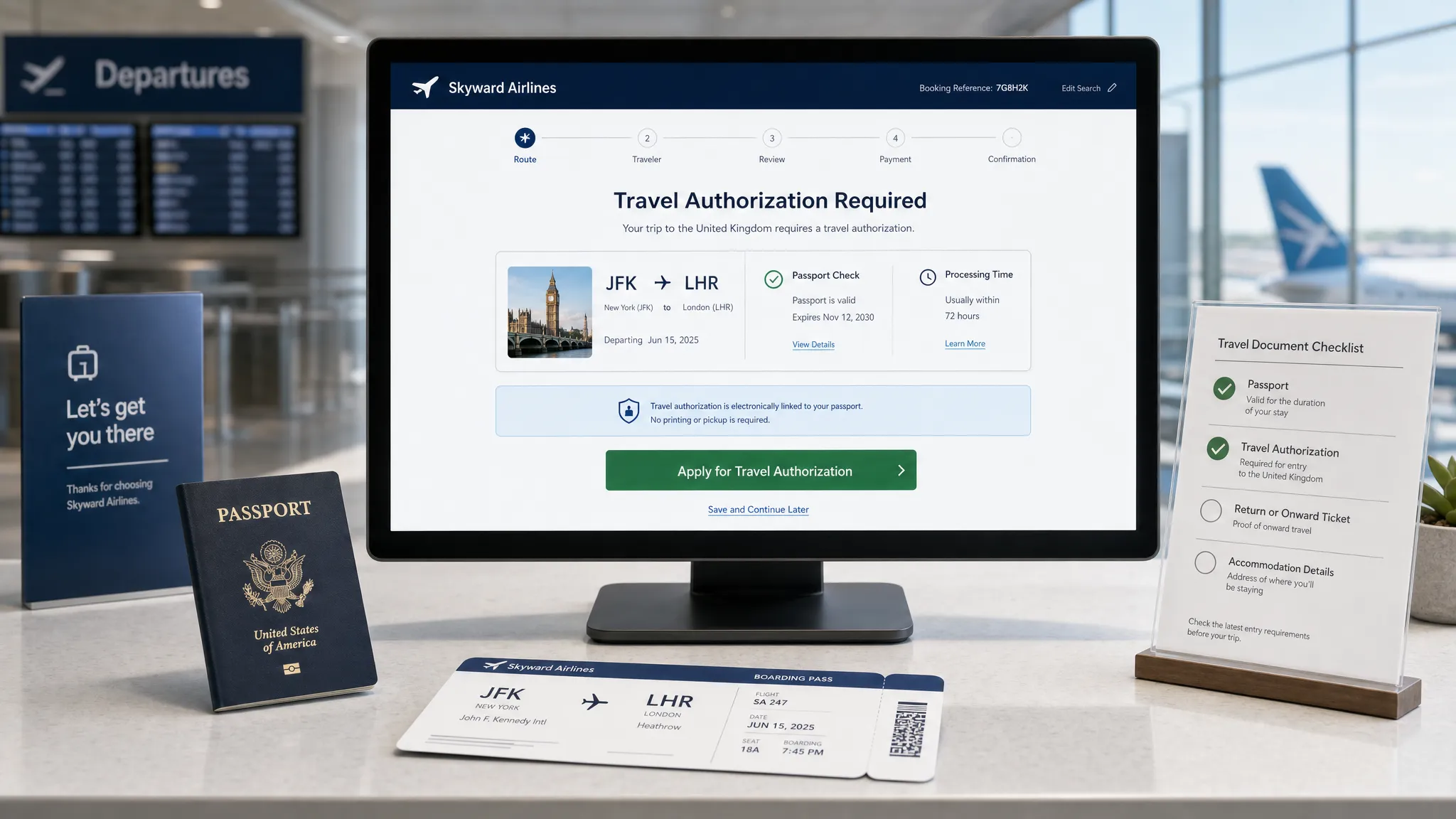
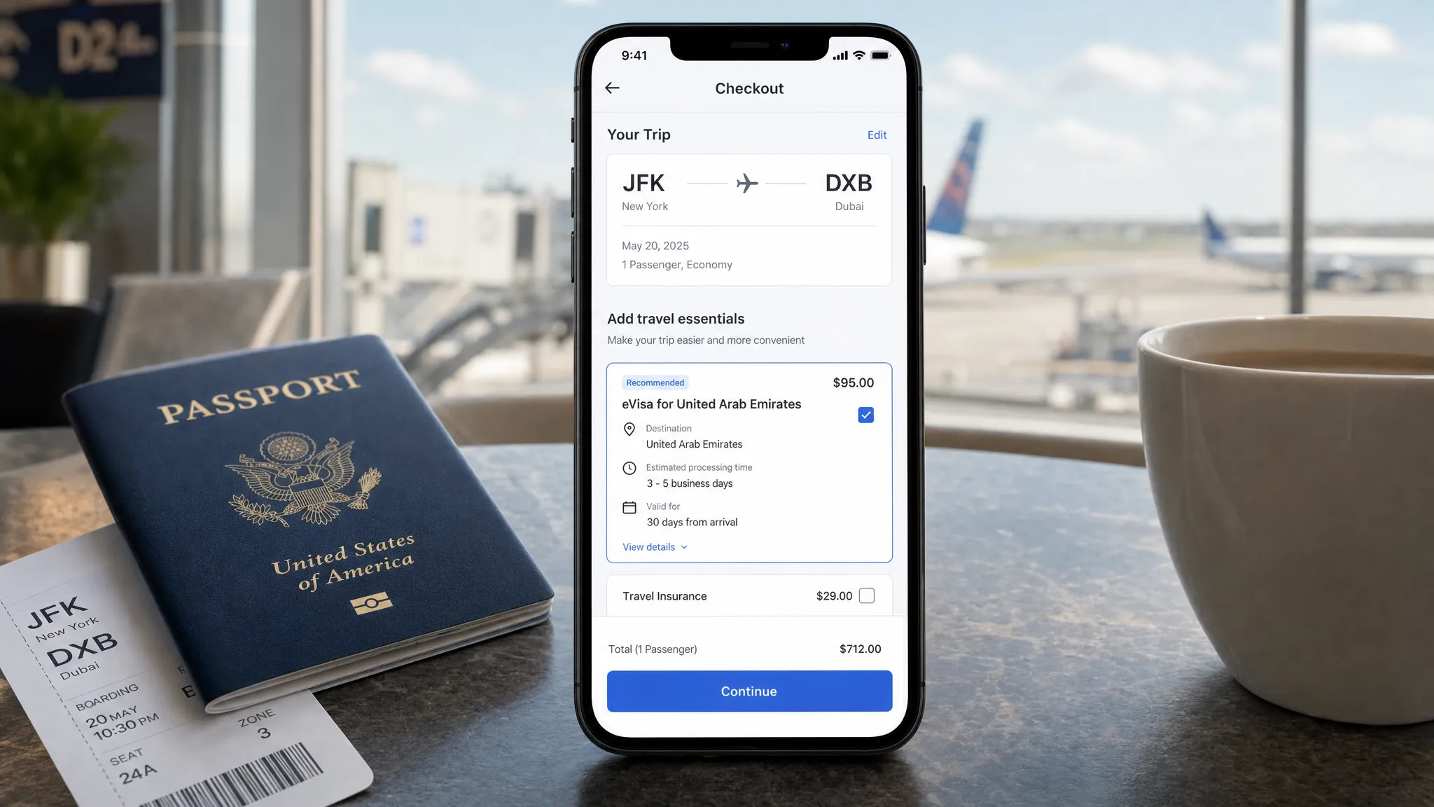
Placement 3: Checkout, the highest-intent conversion point
Checkout is usually the strongest moment to sell visa add-ons because the traveler has chosen a route and is close to payment. The trip is real. The destination is known. The traveler is already making purchase decisions.
However, checkout is also fragile. Too much friction can damage flight conversion, which is far more valuable than any single ancillary. Visa placement in checkout should be helpful, compact, and transparent.
The best checkout modules answer five questions quickly:
| Traveler question | What the module should show |
|---|---|
| Do I need this? | Passport and destination-based eligibility messaging |
| What am I buying? | Guided eVisa or travel authorization application support |
| How much does it cost? | Government fee, service fee, and total price when available |
| How long will it take? | Realistic processing expectation, not a guarantee unless guaranteed |
| What happens next? | Clear next step after payment, such as “Complete application now” or “Start after booking” |
A good checkout placement is usually inline, not hidden in a carousel of unrelated ancillaries. It should sit near travel protection, documents, or trip essentials rather than next to seat maps or meal upgrades. The visual language should signal compliance and trust, not impulse shopping.
If the airline uses a one-page checkout, a compact card works best. If the checkout is multi-step, place the visa add-on after passenger details and before final payment. That sequence gives the airline enough traveler data to personalize the message while still giving the customer time to complete the purchase in one session.
Placement 4: Booking confirmation
Many airlines underuse the confirmation page. It often functions like a receipt, even though it is one of the highest-attention screens in the entire journey. The traveler has just paid and is ready to understand what happens next.
For visa add-ons, confirmation pages should include a “Travel documents” task card. This is not just a revenue opportunity. It is an operational control point.
A strong confirmation placement might include:
- Route and traveler-specific visa status, where available
- A clear CTA, such as “Check visa requirements” or “Start eVisa application”
- A deadline based on departure date and typical processing time
- A reminder that approval is linked to passport details, not just the booking
This placement is particularly effective for travelers who skipped ancillaries during checkout because they were focused on completing the flight purchase. It also works well for corporate travelers, families, and group bookings where the person paying may not have all passport documents ready at checkout.
Placement 5: Manage booking and mobile app trip cards
Manage booking is the natural home for a persistent visa add-on because it matches how travelers prepare for departure. They return to select seats, add bags, change flights, update passenger details, and check travel documents.
The best pattern is a dedicated “Travel documents” section inside the trip card. This section should not only sell an eVisa. It should show progress, status, and next steps. If the traveler has not started, show the requirement. If they started but did not finish, show a resume option. If approval has arrived, show confirmation and storage guidance.
This is where airlines can reduce customer service contacts. Travelers often reach out because they do not know whether a document is required, whether an application was submitted, or where to find approval. A persistent trip-card placement can answer those questions before they become support tickets.
For more on this pattern, see SimpleVisa’s guide to real-time visa status in booking apps.
Placement 6: Pre-departure reminders
Pre-departure messages are effective when they are personalized and timed. A generic “check your visa” email sent to every passenger is easy to ignore. A message that says “Your trip to [destination] is in 14 days. Travelers with your passport may need an eVisa before boarding” is far more useful.
Timing should reflect processing realities. A reminder 48 hours before departure may be useful for fast ETAs, but risky for destinations that require several business days. The safest approach is to trigger reminders based on route, nationality, departure date, and known processing windows.
Email works well for detailed instructions. Push notifications work well for action reminders. SMS can be useful for urgent prompts, but should be used carefully because visa applications involve sensitive personal data and require trust.
The CTA should be specific. “Complete travel authorization” performs better than “Learn more,” because the traveler understands the task.
Placement 7: Online check-in
Online check-in is a last line of defense. It is not the ideal place to introduce a visa for the first time, but it is the right place to detect missing requirements and route travelers toward possible solutions.
A check-in visa placement should be governed by feasibility. If an electronic authorization can still be processed before departure, offer a fast, guided path. If not, the airline should provide clear instructions and avoid selling a service that cannot reasonably help.
This is where trust matters most. The traveler may be anxious, and the airline’s language should be precise. Avoid vague warnings like “You may be denied boarding.” Instead, use actionable language: “We could not confirm that your travel authorization is complete. Check requirements before continuing to the airport.”
Airlines can pair this with document automation to reduce risk. For a deeper operational view, see SimpleVisa’s denied boarding costs checklist for visa compliance.
Placement 8: Airport and agent-assisted recovery
Airport placements should be designed for recovery, not primary conversion. By the time a traveler reaches the airport, time is limited and stress is high. Still, some eVisas and ETAs can be completed quickly enough to save a booking when the traveler is eligible and the destination supports fast processing.
There are three practical airport patterns: QR codes at service desks, agent-assisted tablet flows, and self-service kiosks. The right model depends on the airport environment, staffing, and the type of destinations served.
The message should be direct: “Need to check travel authorization for your trip? Scan to start.” Agents should have a clear escalation path and should never promise border entry. A visa or authorization can support boarding eligibility, but final entry decisions remain with border authorities.
Microcopy that helps travelers act
The words used in a visa placement can make or break trust. Compliance language is often intimidating, but oversimplified copy can create confusion. The best microcopy is specific, calm, and action-oriented.
| Weak copy | Better copy | Why it works |
|---|---|---|
| “Add visa service” | “Check if you need an eVisa for this trip” | Starts with the traveler’s question |
| “Avoid problems at the airport” | “Complete required travel authorization before check-in” | Clear without unnecessary fear |
| “Visa required” | “Based on your route, an entry document may be required” | Avoids overclaiming when passport data is missing |
| “Buy now” | “Start guided application” | Matches the seriousness of the task |
| “Processing is fast” | “Typical processing time: [timeframe], subject to government review” | Sets realistic expectations |
Microcopy should also distinguish between an eVisa, an ETA, and a traditional visa where needed. Travelers often use “visa” as a catch-all term, but product teams should avoid wording that misrepresents the actual document.
How to segment visa add-ons without annoying travelers
The fastest way to reduce conversion is to show visa offers to everyone. A traveler flying domestically does not need the same message as an international traveler with a complex transit. A citizen traveling to their home country does not need the same prompt as a visitor entering for tourism.
Segmentation should consider passport nationality, destination, transit points, departure date, trip purpose if known, booking channel, and whether the traveler has already completed an application. Airlines with loyalty profiles can also use stored nationality or document preferences, subject to consent and privacy rules.
A travel API or custom data service can help determine when the offer should appear, what it should say, and whether the traveler should be routed to a full application flow. That is where visa add-ons become more than marketing placements. They become dynamic border crossing solutions embedded into the customer journey.
For airlines comparing integration approaches, SimpleVisa’s guide on API vs. white-label visa apps explains the trade-offs between native control and speed to market.
A/B tests worth running
Visa placements should be tested like any other ancillary, but with additional attention to trust, completion, and support impact. The goal is not only attach rate. It is successful application completion without harming flight conversion.
| Test hypothesis | Variation to test | Primary metric | Secondary metric |
|---|---|---|---|
| Fee transparency improves trust | Total price shown upfront vs. later in flow | Visa add-on conversion | Refunds and support contacts |
| Specific requirement copy beats generic copy | Passport-aware message vs. “visa may be required” | Click-through rate | Application completion |
| Checkout plus post-booking beats checkout only | Add confirmation task card | Total attach rate | Flight checkout conversion |
| Deadline-based reminders drive action | “Apply by [date]” vs. generic reminder | Reminder conversion | Late support tickets |
| Inline cards beat pop-ups | Inline module vs. modal | Add-on conversion | Checkout abandonment |
| Resume prompts recover drop-off | Manage booking resume card vs. no card | Completion rate | Time to completion |
| Trust signals matter | Security and fee explanation shown vs. hidden | Start rate | Payment completion |
The best airline teams monitor the full funnel: impression, click, start, document upload, payment, submission, approval, and traveler satisfaction. If a placement increases clicks but creates more abandoned applications, it may be attracting curiosity rather than intent.
Common placement mistakes to avoid
Even well-designed visa programs can underperform when placement strategy is too aggressive or too generic.
- Placing the offer only after payment: Post-booking is valuable, but checkout is often the strongest purchase moment.
- Treating every destination the same: Visa urgency varies widely by route, nationality, and processing time.
- Using fear-based copy: Compliance matters, but scare tactics can reduce trust and increase calls.
- Hiding service fees: Travelers are more likely to accept a visa add-on when pricing is transparent.
- Ignoring mobile UX: Many travelers complete pre-trip tasks on phones, especially close to departure.
- Selling at check-in when processing is unrealistic: Last-minute offers should be limited to routes and documents that can still be completed in time.
Implementation: API, white-label, or no-code
Airlines do not need the same implementation model at every maturity stage. A carrier testing demand on a few routes may prefer a no-code or white-label approach. A larger airline with a mature digital product team may want a travel API integrated directly into search, checkout, manage booking, and check-in.
A practical rollout often starts with one or two high-need corridors. For example, an airline might begin with destinations that have mandatory electronic travel authorizations, high support volume, or frequent denied-boarding risk. After proving conversion and operational impact, the airline can expand to more markets.
SimpleVisa supports several models for airlines and travel businesses, including API integration, a white-label visa application app, no-code implementation options, guided customer visa applications, custom data services, and premium eVisa management. That flexibility matters because placement strategy should match the airline’s product roadmap, not force a single technical path.
If your team is building a broader travel document automation layer, this guide to travel document automation can help align product, compliance, and commercial stakeholders.
Frequently Asked Questions
Where should airlines place visa add-ons for the best conversion? Checkout is often the highest-intent placement, but the best results usually come from a combination of checkout, booking confirmation, manage booking, pre-departure reminders, and online check-in eligibility checks.
Should airlines show visa add-ons during flight search? Yes, but lightly. Search and flight results are best for awareness, not full application flows. Use short requirement teasers or eligibility prompts, then move the traveler to a guided path later.
Can visa add-ons hurt flight conversion? They can if they are intrusive, vague, or shown to the wrong travelers. Use eligibility-based targeting, transparent pricing, and inline placements to protect the core booking flow.
What is the difference between a visa add-on and a travel document check? A travel document check tells the traveler what may be required. A visa add-on lets the traveler take action, such as starting a guided eVisa or travel authorization application.
Should airlines offer visa services at online check-in? Yes, but only when useful. Check-in is a good final compliance checkpoint, but airlines should avoid selling services that cannot realistically be completed before departure.
How can airlines measure whether visa placements work? Track impressions, clicks, application starts, completed applications, approval outcomes, ancillary revenue, checkout impact, support contacts, and denied-boarding incidents.
Turn visa placement into a better travel experience
The most effective visa add-ons for airlines are not bolted onto the journey. They are placed where travelers naturally ask, “What do I need before I fly?”
SimpleVisa helps airlines and travel businesses embed guided eVisa and travel authorization services through API integration, white-label applications, custom data services, and no-code options. If your team wants to reduce document friction while growing ancillary revenue, visit SimpleVisa to explore the right integration model for your airline.