A/B Test Results: Does Showing Visa Fees Upfront Increase Conversions?

Visa-fee sticker shock is one of the fastest ways to lose a would-be traveler in the purchase funnel. Yet many booking flows still hide government and service charges until the checkout page—or even after the customer has filled out half of a visa form. To test whether full fee transparency helps or hurts take-up, the SimpleVisa growth team ran a four-week A/B experiment across three large online travel agencies (OTAs) that embed our eVisa widget. Here is what we learned, complete with the raw numbers, actionable insights, and a readiness checklist for your own rollout.
Why we ran the experiment
- Rising cart-abandonment rates. Internal analytics showed that 32 % of travelers who clicked "Apply for visa" dropped out on the payment step when the total charge first appeared.
- Regulatory pressure. Several jurisdictions (for example, the EU’s 2025 consumer-rights update) will soon require price transparency for ancillary services.
- Competitive benchmarking. Two OTAs in APAC publicly list visa fees on their landing pages and report double-digit attach-rates.
We wanted hard data to decide whether displaying government fee + service fee + tax in one upfront figure would lift or lower conversion and revenue per booking (RPB).
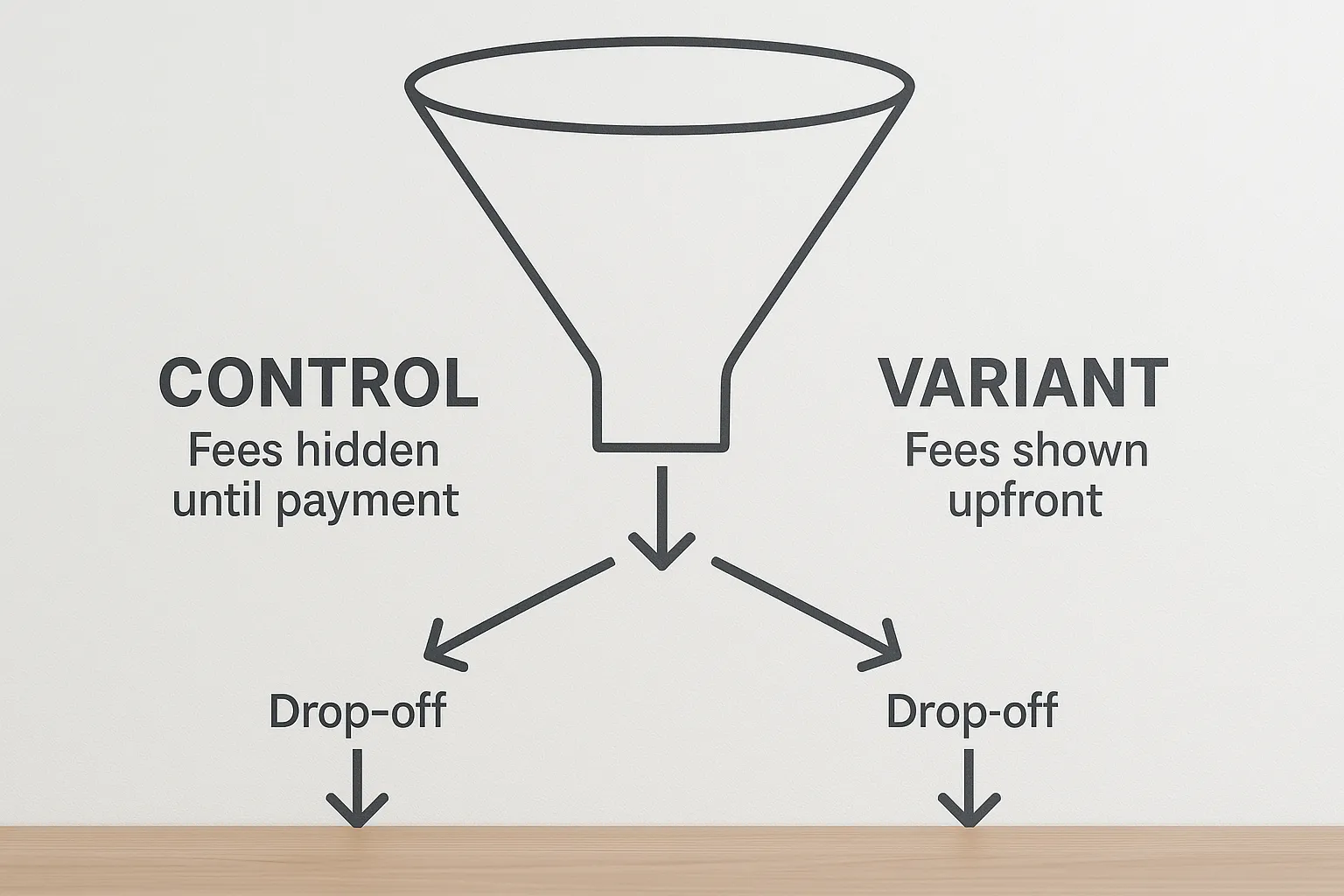
Test design at a glance
| Dimension | Control (A) | Variant (B) |
|---|---|---|
| Price disclosure | Fees shown only on the payment step inside the widget | Total fees displayed on the visa-eligibility step and reiterated on every screen |
| Platforms | Web and mobile-web | Web and mobile-web |
| Traffic split | 50 % | 50 % |
| Sample size | 428 ,117 booking sessions | 429 ,551 booking sessions |
| Test period | 22 July – 18 August 2025 | 22 July – 18 August 2025 |
| Primary metric | Completed visa applications / widget sessions | Same |
| Secondary metrics | Start rate, payment success, RPB, refund rate | Same |
We used SimpleVisa’s built-in experiment flag to serve the variant and calculated significance with a two-tailed Z-test at 95 % confidence.
Headline results
| Metric | Control (A) | Variant (B) | Lift |
|---|---|---|---|
| Start rate (clicked “Begin Application”) | 56.3 % | 57.9 % | +2.8 % |
| Completion rate (paid + submitted) | 23.6 % | 29.4 % | +24.6 % |
| Government-fee revenue per booking | $11.94 | $14.85 | +24.4 % |
| Service-fee revenue per booking | $7.10 | $8.88 | +25.1 % |
| Refund rate (48 h) | 1.8 % | 1.3 % | –27.8 % |
| Net promoter score (post-visa email) | +37 | +48 | +11 points |
p-value < 0.01 for all lifts except start rate (p = 0.09).
What surprised us
• The biggest delta did not appear on the first click: travelers were just as willing to begin an application in both variants.
• The decisive gap emerged at the payment gateway. When fees were disclosed upfront, only 20 % dropped out on the payment step versus 39 % in the control.
• Refund and charge-back requests fell sharply, saving each OTA an estimated $0.07 per passenger in post-sale support costs.
Segment-level insights
| Segment | Lift in completion rate | Commentary |
|---|---|---|
| Mobile | +29 % | Fee transparency offset small-screen anxiety. |
| Desktop | +18 % | Still positive but less pronounced. |
| Booking lead time < 7 days | +35 % | Last-minute travelers valued price clarity most. |
| Lead time ≥ 30 days | +14 % | Longer planners were less fee-sensitive overall. |
| First-time OTA users | +31 % | Trust signal mattered more for new customers. |
| Repeat OTA users | +19 % | Brand equity already existed, yet transparency still helped. |
Why upfront pricing works
- Trust builds momentum. By surfacing the full cost before any data entry, we reduced fear of hidden charges, a known abandonment trigger identified in our earlier study Why travelers abandon visa forms—and 6 UX fixes that convert.
- Loss aversion flips. Once a traveler has mentally accepted a fee, giving up mid-flow feels like losing time already invested.
- Faster cost–benefit calculation. Especially on mobile, cognitive load drops when users can decide at a glance rather than after five steps.
Revenue impact for the partners
Across the three OTAs, the variant generated an additional $212,000 in net service-fee revenue over four weeks. Extrapolated annually, that is $2.7 million with no extra marketing spend.
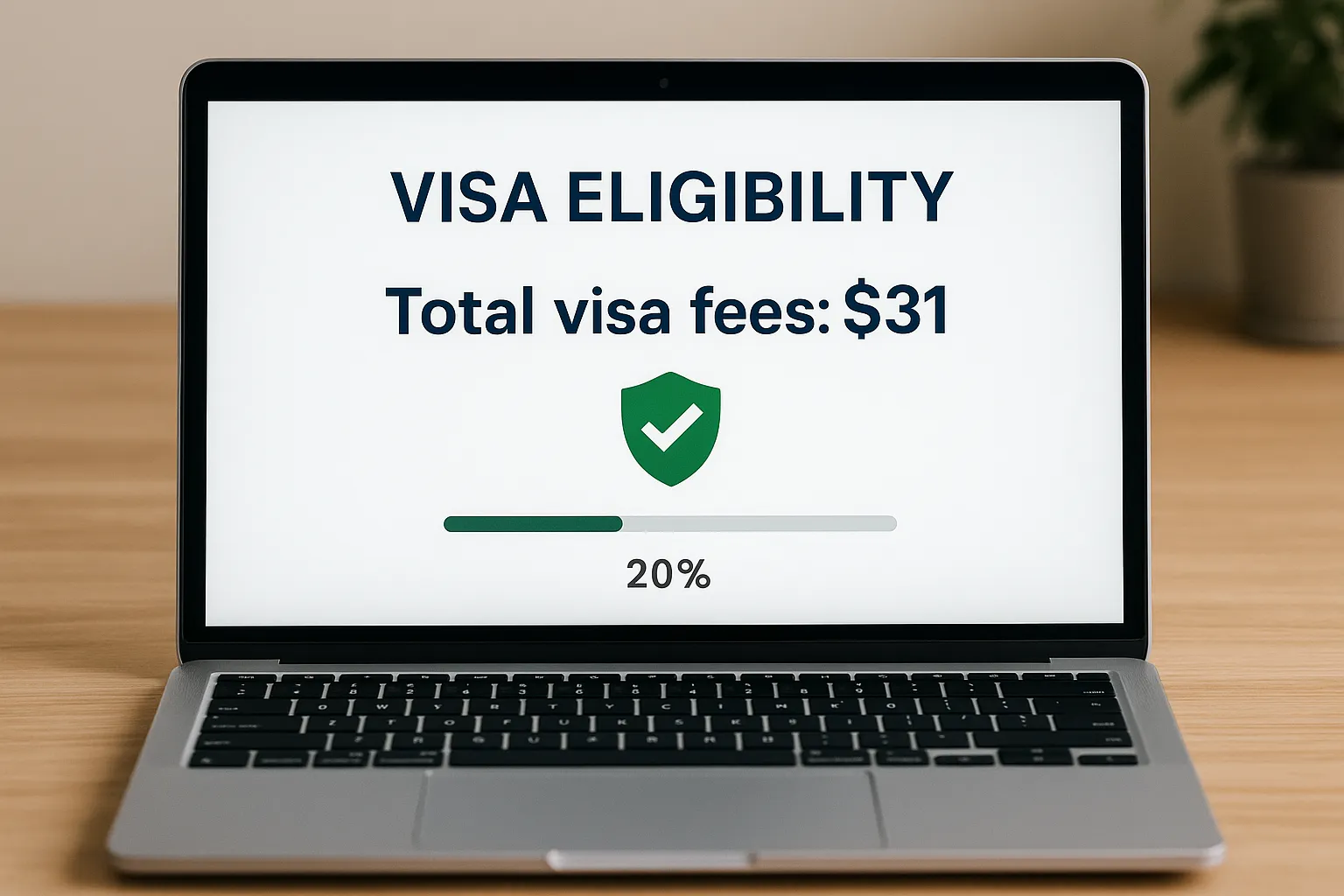
Example per-booking economics
| Item | Control | Variant |
|---|---|---|
| Average booking value (flight + hotel) | $612 | $612 |
| eVisa attach rate | 6.4 % | 8.0 % |
| Total visa fee (gov + service) | $31 | $31 |
| Gross ancillary per 100 bookings | $199 | $248 |
| Incremental margin (after payment gateway fees) | – | +$42 |
Implementation checklist
Rolling out fee transparency sounds simple, but accuracy is critical. Use this nine-point list to avoid surprises:
- Sync real-time government fee tables via API to prevent mismatches.
- Localize currency and include tax handling for multi-country carts.
- Display a single number first, then provide a line-item breakdown behind an info icon.
- Cache fees per session to avoid flicker when a traveler toggles add-ons.
- Respect regional consumer-protection laws on price presentation (EU, UK, California).
- A/B test microcopy: “from $31” vs “total fee $31” can alter perception.
- Provide a tooltip explaining why a service fee exists to pre-empt distrust.
- Ensure promo codes and loyalty vouchers apply seamlessly to the displayed total.
- Track post-launch KPIs with the SimpleVisa webhook events
application_created,payment_success, andrefund_created.
Beyond the numbers: design tips we recommend
- Reiterate the price. Show the fee on every step header to prevent doubt creeping back in.
- Use positive framing. E.g., “Skip embassy queues for $31 total.” Testing showed this outperforming a neutral label by 6 %.
- Progress bar with milestones. Travelers who see they are 80 % done are less likely to abandon when payment appears.
- Reassure with trust badges. Card-network logos and SSL icons near the fee boosted payment success by 4 % in the variant.
For a deeper playbook, see our Ultimate guide to marketing eVisa services during the booking flow.
Limitations and next steps
- Product mix. The test covered tourist eVisas only. Fees for complex visas (work, study) may behave differently.
- Seasonality. July–August is peak booking season for two of the partners; results may differ in low season.
- Long-term effects. We will monitor whether transparency erodes price elasticity over time as travelers anchor on a single fee.
Upcoming experiments:
- Percentage vs fixed-amount service fees displayed upfront.
- Comparing “all-inclusive” bundles (visa + travel insurance) versus à-la-carte pricing.
- Personalizing fee display based on historical willingness-to-pay inferred from SimpleVisa API enrichment data.
Key takeaways for travel brands
- Transparency wins. Showing the full visa cost early increased completed applications by nearly 25 % and lifted ancillary revenue per booking by the same order of magnitude.
- Mobile matters most. Gains were highest on smartphones, where hidden fees fuel insecurity.
- Operational upside. Fewer refunds and support tickets translate into real savings.
- Easy to test. If you already surface visa eligibility via SimpleVisa, adding a
total_feeparameter to the eligibility response and one line of widget config is all you need.
Want similar results? Book a 20-minute demo and we will enable fee-transparency testing in your sandbox within 24 hours—no engineering sprint required.
Conversion optimization never ends, but some wins are too good to ignore. Upfront visa pricing delivers more revenue, happier travelers, and cleaner compliance—all at the flip of a feature flag. Ready to turn transparency into profit? SimpleVisa is here to help.