eVisa Status Page UX: What to Show at Each Status

A great eVisa status page does more than “show progress.” It reduces traveler anxiety, prevents support tickets, and protects your booking by making the next step obvious at every moment.
For travel brands, the status page is also where trust is earned. Visa and ETA journeys are high-stakes, time-sensitive, and unfamiliar for most customers. When a traveler cannot tell what is happening, they assume something is wrong.
This guide breaks down what to show at each eVisa status (and what not to), with UX patterns you can use whether you are embedding a visa flow inside checkout, sending customers to a white-label app, or managing applications post-booking.
First: define what your status page must accomplish
Before you design the UI, align stakeholders on the job the page must do.
A high-performing eVisa status page should:
- Confirm the traveler is in the right place (correct trip, correct applicant, correct destination).
- Explain what the current status means in plain language.
- Show time expectations (what happens next and typical time ranges, without overpromising).
- Offer the correct next action (upload, fix, wait, contact support, download).
- Create an audit trail (timestamps, reference numbers, proof of submission/decision).
- Reduce duplicate contact (“any update?” tickets) via proactive updates and self-serve answers.
If you need broader journey mapping beyond the status page, SimpleVisa’s post-booking playbooks are a helpful complement: Building a Seamless Post-Booking Visa Journey.
Use a status model travelers can understand
Many visa platforms expose internal operational states that confuse end users. Your customer-facing taxonomy should be stable and limited.
A practical rule: 8 to 12 user-facing statuses is usually enough, even if your backend has 40.
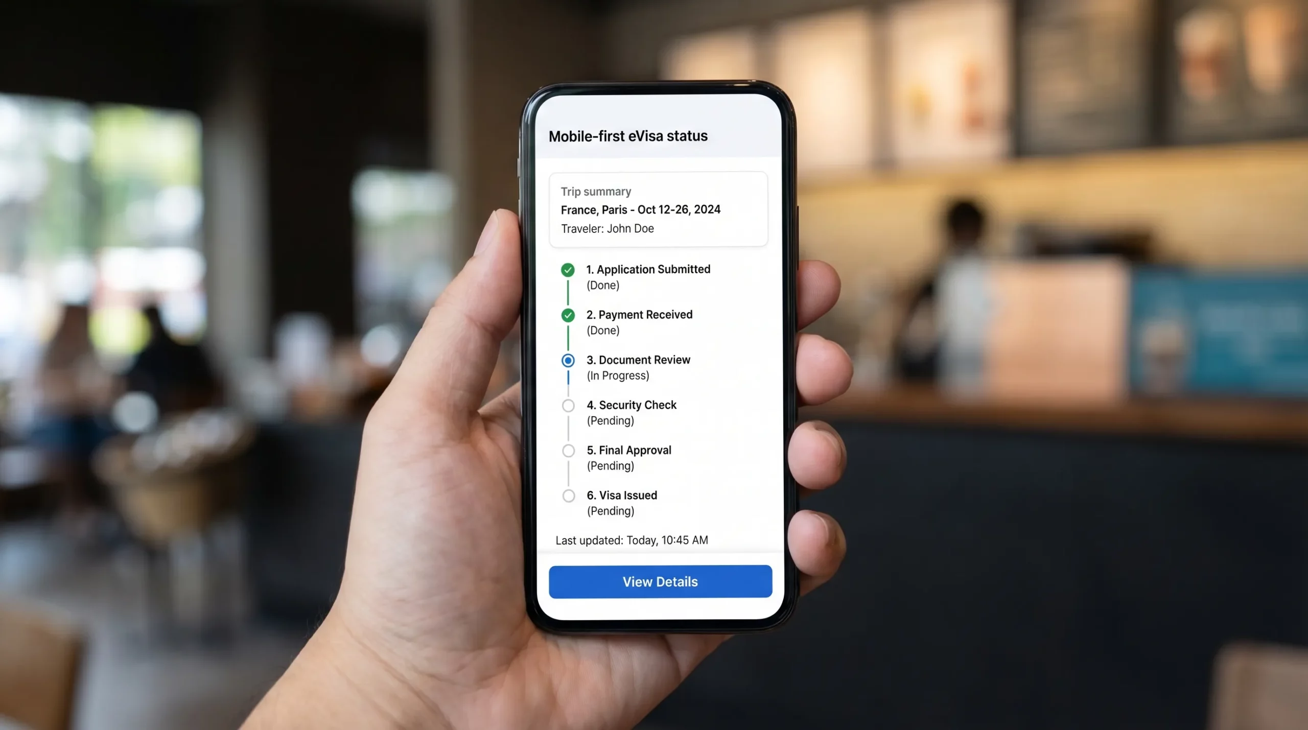
Here is a traveler-friendly status model you can adapt.
| User-facing status | What the traveler is thinking | What you should show | Primary CTA | When to trigger notifications |
|---|---|---|---|---|
| Not started | “Do I need to do anything?” | Eligibility summary, required docs, time estimate, start button | Start application | Immediately after booking or when travel dates entered |
| In progress (draft) | “I’ll finish later.” | Step completion, saved data confirmation, missing items list | Continue | If draft inactive for X hours/days |
| Payment pending | “Did my payment go through?” | Amount, currency, payment method, retry option, receipt rules | Pay / Retry payment | After failed payment, before deadline |
| Submitted | “Is it really sent?” | Submission timestamp, reference ID, what happens next | View details | Immediately on submission |
| Under review | “How long will this take?” | Typical processing range, last updated, escalation rules | Check requirements | If review exceeds typical range |
| Action required (docs/info) | “What do you need from me?” | Exact request, examples, upload requirements, deadline | Upload documents | Immediately when request arrives |
| Approved | “Great, what now?” | Approval notice, validity basics, entry reminders | Download / Save | Immediately on approval |
| Issued (eVisa ready) | “Show me the document.” | Download link, document storage tips, print guidance | Download eVisa | Immediately on issuance |
| Rejected/Refused | “What can I do?” | Reason category (if available), next options, refund rules, support escalation | Get help / Reapply | Immediately on decision |
| Canceled/Expired | “Is my trip at risk?” | What cancellation means, whether resubmission is possible | Start new application | Immediately on cancellation/expiry |
If your product must support both eVisas and eTAs (like ESTA, ETA, ETIAS), keep the same UX pattern and only change the terminology.
What every eVisa status page should include (regardless of status)
These components should be consistent across all statuses so travelers do not have to re-learn the page each time.
1) Trip and applicant summary
Show a compact summary card at the top:
- Destination country (and visa type if applicable)
- Traveler name (as on passport)
- Passport nationality
- Intended arrival date (and departure date if collected)
- Application reference ID
This prevents the most common panic: “Am I looking at the right application?”
2) “Last updated” and a visible status history
A single status label is not enough. Add:
- Last updated timestamp
- A short status history (for example: Draft created, Submitted, Under review)
Status history increases perceived transparency even when nothing changes for days.
3) Clear expectations and boundaries
Set expectations without making promises:
- Typical processing time range (if you can provide one)
- A note that processing times can vary by government workload
- What the traveler should not do (for example: “Do not book non-refundable travel until you have approval,” if relevant to your use case)
4) Help options that match the situation
When anxiety spikes, travelers look for a human. Do not hide support.
- Provide a “Get help” entry point that can route by status
- Pre-fill the reference ID in the support request
If you are designing partner flows, you can also link to a dedicated help hub. Example: Visa Contact Us: Get Instant Support.
5) Security and trust signals
Travelers are sharing sensitive personal data. Reinforce trust with:
- Brief statement on secure handling of documents
- A reminder to verify traveler details match the passport
- A warning about phishing or unofficial sites if users are likely to search elsewhere
eVisa status-by-status UX: what to show and why
Below are recommended content blocks and CTAs for each key status.
Status: Not started
This is where you prevent abandonment before it happens.
Show:
- Eligibility snapshot (“Based on your passport and destination, you likely need an eVisa / authorization.”)
- What the traveler will need (passport scan, photo, itinerary, etc.)
- Time-to-complete estimate for the form (for example: “Takes about 5 to 10 minutes” only if accurate for your flow)
- Processing-time guidance (range, not a promise)
Primary CTA:
- Start application
UX tip: If you sell visas as an add-on, this status is a conversion point. Make the value explicit (fewer mistakes, guided steps, centralized tracking) rather than “because we said so.”
Status: In progress (draft)
Drafts usually fail for two reasons: users hit a document requirement they cannot satisfy immediately, or they get interrupted.
Show:
- Completion meter (for example: 60% complete)
- A checklist of what is missing (and why)
- “Saved” confirmation with time
- Resume link that returns to the exact step they left
Primary CTA:
- Continue
UX tip: Add a secondary action like “Email me a reminder” or “Send link to my phone” if your channel mix supports it.
Status: Payment pending
Payment confusion causes duplicate charges, chargebacks, and support tickets.
Show:
- Amount, currency, and what it covers (government fee vs service fee) if your business model requires transparency
- Payment status (“Failed,” “Incomplete,” “Awaiting confirmation”)
- What happens if payment is not completed (application will not be submitted)
- Receipt rules and where it will be sent
Primary CTA:
- Pay now or Retry payment
UX tip: If payment is being confirmed asynchronously, say so plainly: “Payment is processing. Do not refresh. This can take up to X minutes.” Only include X if your PSP behavior is known.
Status: Submitted
This is the “proof” state. Travelers need to know it is truly sent.
Show:
- Submission timestamp
- Reference number(s) (your ID and, if available, the government case ID)
- What will happen next (automated checks, manual review, possible requests)
- How they will be contacted if more info is needed
Primary CTA:
- View submitted details
UX tip: Lock edits by default to avoid inconsistencies, but provide a clear path if amendments are possible.
Status: Under review
Under review is where travelers repeatedly refresh and contact support. Your job is to make waiting feel safe.
Show:
- Current stage explanation in plain language
- Typical processing range (and a reminder it varies)
- “What you can do now” checklist (verify passport validity, prep backups, watch inbox)
- Escalation criteria (for example: “If your travel date is within X days, contact support”) only if you can honor it
Primary CTA:
- Check requirements or Contact support (depending on how close travel dates are)
UX tip: Consider a “quiet mode” message: “No action needed right now. We will notify you when the status changes.” This reduces compulsive refreshing.
Status: Action required (additional documents or corrections)
This is the highest-risk status. If the traveler fails here, the visa fails.
Show:
- Exactly what is requested (one clear sentence)
- Why it is needed (short explanation)
- Upload specs: file types, max size, photo requirements
- A deadline with timezone
- Examples of acceptable documents
- A confirmation when upload succeeds
Primary CTA:
- Upload documents
UX tip: Avoid vague labels like “More information needed.” Name the request: “Upload passport bio page” or “Correct passport number.”
Status: Approved
Approved is emotional relief, but travelers still need operational clarity.
Show:
- Approval confirmation
- Core conditions at a glance (validity window, entries allowed) if your system can display this accurately
- Reminder: approval is not always a guarantee of entry (word this carefully, and keep it consistent with your legal guidance)
Primary CTA:
- Download (if document is already issued) or Wait for issuance (if there is a separate issuance step)
UX tip: Many travelers immediately start planning. This is a good time to encourage responsible, trip-supporting actions without distracting from the core goal. For instance, someone headed to Spain might plan downtime in advance, like booking a massage and wellness treatment in Valencia once their documents are confirmed.
Status: Issued (eVisa ready to present)
This is where you make the traveler “border-ready.”
Show:
- Download button (PDF) and, if applicable, a wallet-friendly format
- Document number and issuance date
- Storage guidance (save offline, email to yourself, keep a printed copy if recommended)
- What to present at check-in and at the border, if destination practices are known and you can state them responsibly
Primary CTA:
- Download eVisa
UX tip: Provide a “Verify details” prompt (name, passport number, dates). A simple checklist prevents costly border issues.
Status: Rejected/Refused
This status must be handled with care. You need empathy, clarity, and next steps.
Show:
- Decision result (“Not approved”)
- Reason category if provided by the issuer (do not invent reasons)
- What options exist next (reapply, alternative visa type, contact issuer, support escalation)
- Refund rules if relevant (clearly state what is refundable vs non-refundable, only if you can do so accurately)
Primary CTA:
- Get help or Start a new application
UX tip: Do not bury the traveler in legal text. Give them the shortest route to a workable plan.
Status: Canceled or Expired
This is a “trip at risk” moment.
Show:
- Why the application ended (canceled by user, expired due to inaction, expired due to travel date passing)
- Whether resubmission is possible
- What data is preserved (if any) and what must be re-entered
Primary CTA:
- Start new application
Microcopy rules that prevent support tickets
Status labels are not enough. The explanation under the status is what customers remember.
Use these rules:
- Lead with the meaning, not the internal process. “We are waiting for the government decision” beats “Case in adjudication queue.”
- Always include the next best action. Even if that action is “No action needed.”
- Avoid false precision. “3 days” is worse than “typically a few days” if you cannot guarantee 3.
- Repeat key identifiers. Reference ID and applicant name should be visible without scrolling.
If form abandonment is a broader issue in your flow, pair the status page with conversion-focused form UX fixes: Why Travelers Abandon Visa Forms, and 6 UX Fixes That Convert.
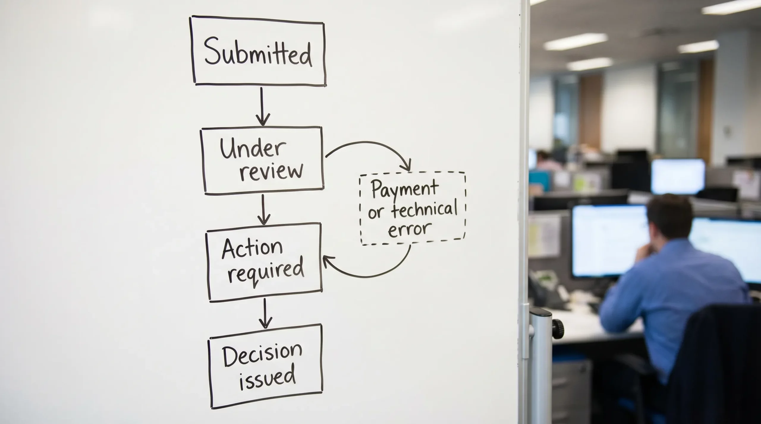
Product and engineering considerations (so UX does not break in production)
A status page is only as good as the system behind it.
Use event-driven updates when possible
Polling can be fine, but status changes are inherently event-based. If your visa workflow supports it, consider webhooks or server events so:
- The “Last updated” timestamp is trustworthy
- Notifications trigger only on meaningful changes
- You can show a clean status history
If you are integrating visa flows into booking, it also helps to understand the end-to-end API mechanics so status mapping stays consistent: How eVisa APIs work: Step by Step.
Design for edge cases, explicitly
Common edge cases that should have dedicated UX states:
- Payment captured but submission failed
- Document upload succeeded but validation failed
- Duplicate application detected
- Travel date is too close for standard processing
Do not hide these behind generic “Something went wrong.” Your support team will pay the cost.
FAQ
How many eVisa statuses should we show to travelers? Most travel brands do best with 8 to 12 user-facing statuses. Keep backend complexity internal, and map it to stable, understandable labels.
What is the most important element on an eVisa status page? A clear explanation of what the status means, plus a single obvious next step. Add timestamps and reference IDs to reduce “is this real?” anxiety.
Should we show processing time estimates on the status page? Yes, but use ranges and disclaimers. Avoid exact promises unless you have an SLA you can reliably meet and a process to handle exceptions.
How do we reduce “any update?” support tickets during Under review? Show last updated, status history, typical time ranges, and proactive notifications when status changes. Also explain what “no news” means.
What should we show when a traveler is rejected? The decision, the reason category if provided, and the practical next options (reapply, alternate path, contact support). Avoid blame and avoid speculative explanations.
Build a status experience that keeps travelers confident
If you are building or upgrading an eVisa journey, the status page is one of the highest leverage screens. It can reduce operational load, increase completion rates, and improve traveler trust.
SimpleVisa helps travel businesses streamline eVisa applications with automation, guided customer flows, and flexible implementation options (API integration, white-label app, data services, and no-code setups).
Explore SimpleVisa at simplevisa.com to see how a modern visa management platform can fit into your booking and post-booking experience.