Visa Made Easy: Embed eVisas in Your Booking Flow

Travel bookings fail for reasons that have nothing to do with price or inventory. One of the most preventable is visa friction: a traveler books confidently, then realizes they need an eVisa (or an eTA/ETA), abandons the trip, or worse, gets denied boarding.
Embedding eVisas directly into your booking flow turns that friction into a guided, revenue-generating step. Done well, it also reduces support load and protects your brand from “you never told me” complaints.
What “embedding eVisas in your booking flow” really means
An embedded eVisa experience is not just a link to a government portal. It’s an in-context journey where the traveler can:
- See personalized entry requirements based on itinerary and nationality
- Understand what document they need (eVisa vs visa-on-arrival vs eTA/ETA vs consular visa)
- Start a guided application with clear document prompts
- Pay and submit without leaving your environment
- Track status and receive reminders until departure
From a travel business perspective, the goal is simple: make border compliance feel like a natural part of booking, not a separate project the traveler must remember later.
If you want a deeper primer on the concept (beyond visas alone), SimpleVisa also covers the broader category in What Is Travel Document Automation? Definitions, Benefits, and Myths.
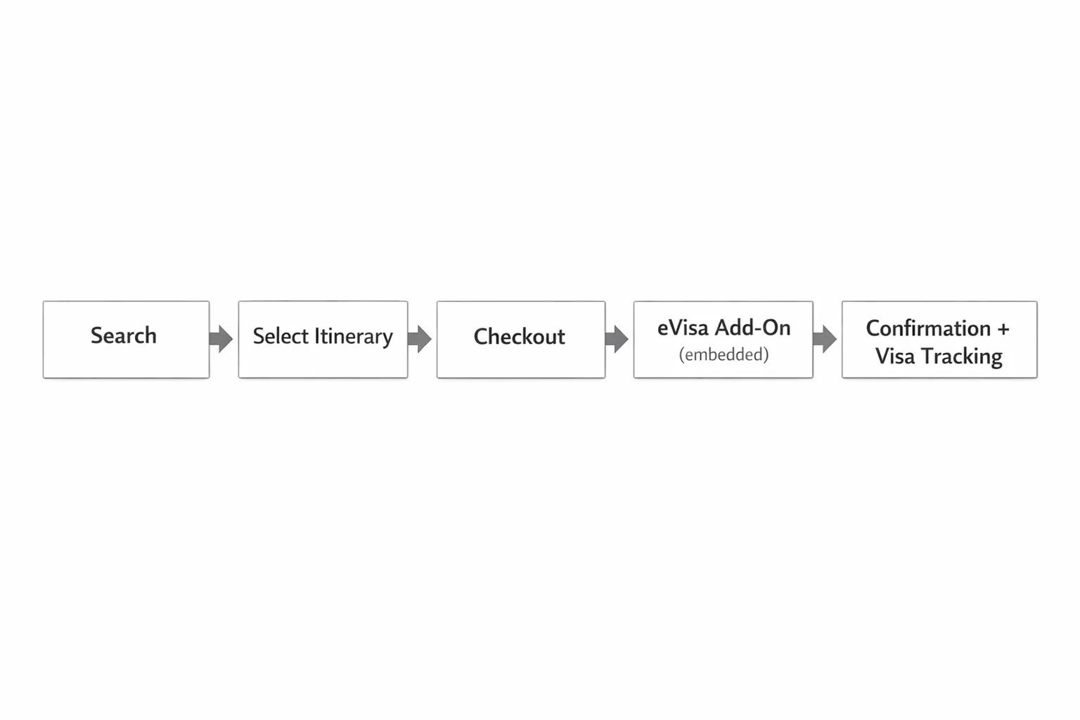
Where to place eVisas in the customer journey (and why it matters)
“Embed eVisa” can mean several placements. The best choice depends on your funnel, your average booking window, and the destinations you sell.
| Placement | Best for | What you gain | What to watch out for |
|---|---|---|---|
| Pre-booking (search/results or itinerary page) | High-consideration trips, complex entry rules | Sets expectations early, prevents mismatched bookings | Too early can distract from conversion if messaging is heavy |
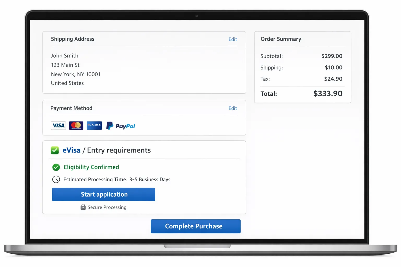
| Checkout (as an add-on) | Airlines, OTAs, cruises, package checkout | Highest visibility, clean ancillary attachment | Must be fast and mobile-friendly to avoid checkout friction |
| Post-booking (confirmation page + email/SMS) | Short booking windows, tours, dynamic itineraries | Lets traveler finish booking first, then complete compliance | Requires strong follow-up, otherwise travelers procrastinate |
A common best practice is a two-step approach:
- At checkout: show eligibility and offer the eVisa as an add-on
- Post-booking: deliver a one-click continuation into the guided application (with reminders)
For messaging and timing ideas across touchpoints, see SimpleVisa’s Building a Seamless Post-Booking Visa Journey: Tools & Templates.
Choose the right integration model: API, widget, white-label, or data
Most travel teams don’t fail because they “don’t want visas.” They fail because they pick an integration approach that doesn’t fit their product and engineering capacity.
SimpleVisa supports multiple ways to deploy visa services (API integration, white-label app, and data services, including no-code implementation options). Here’s how to think about the trade-offs.
| Model | What it’s best for | Who owns UX | Typical effort |
|---|---|---|---|
| API embedded into your flow | Highly customized checkout and account experiences | You | Medium to high (depends on scope) |
| Embedded widget / no-code implementation | Fast launch, pilots, limited engineering bandwidth | Shared (you brand it, provider powers it) | Low |
| White-label visa application app | Standalone branded visa hub, multi-itinerary travelers | Shared | Low to medium |
| Custom data services | Requirement checks, internal tooling, call center enablement | You | Medium |
If you’re deciding between API and a white-label approach, SimpleVisa breaks down practical decision criteria in API vs. White-Label App: Which Visa Integration Model Suits You?.
The “minimum viable” embedded eVisa flow (what to build first)
You don’t need a perfect end-to-end compliance platform on day one. You need a flow that captures demand, guides the traveler correctly, and avoids preventable errors.
A solid minimum viable embedded flow usually includes:
1) Eligibility check that feels instant
At minimum, the traveler should be able to answer:
- Do I need anything to enter?
- If yes, is it an eVisa, an eTA/ETA, or a traditional visa?
- When should I apply (based on my departure date)?
This is where conversion is won or lost. If you bury the answer in paragraphs of legal language, travelers will leave. If you want a traveler-facing reference for timing, SimpleVisa’s guide on when to apply for an eVisa is a useful model for the type of clarity that reduces anxiety.
2) A clear, optional add-on moment
Most travel brands treat ancillaries as “nice-to-haves.” Visas are different: they are often a trip enabler.
Your offer copy should be direct:
- “Check your entry requirements” (free)
- “Apply now in minutes” (paid service)
- “Get status updates before departure” (reassurance)
3) Guided application with dynamic document prompts
The most common cause of delays and refusals is not malice, it’s incomplete or inconsistent information. Your embedded flow should help the traveler avoid:
- Mismatched passport details
- Incorrect photo format
- Missing supporting documents
- Wrong visa category for the purpose of travel
If you need a benchmark for what “good guidance” looks like, SimpleVisa’s traveler-facing Checklist: Everything You Need Before Submitting an Online Visa Application shows the level of specificity that prevents rework.
4) Status tracking and proactive reminders
A visa flow without tracking is a support ticket generator. Even simple status notifications reduce “Any update?” contacts and keep travelers confident.
5) A border-ready output
Travelers should be able to retrieve their approved eVisa easily and understand what to present at check-in and arrival. (Some destinations still request a printed copy, even for electronic documents.)
UX patterns that make “visa made easy” feel true
Because visa applications involve sensitive personal data, travelers have two fears:
- “This is complicated and I’ll mess it up.”
- “Is this legit and secure?”
The right UX addresses both.
Reduce effort with progressive steps
Long forms feel endless on mobile. Break the application into short steps with visible progress.
Use plain language microcopy
Translate immigration terminology into human language. For example, explain “purpose of travel” with examples relevant to your trip types.
Make document capture mobile-native
Most travelers will upload photos and passport scans from their phone. If upload fails or requirements are unclear, they abandon.
Show pricing and what’s included upfront
Surprise fees are a trust killer. Transparent pricing also reduces chargebacks.
Add trust signals at sensitive moments
At payment and document upload steps, reassure travelers about security, data handling, and support channels.
SimpleVisa covers common abandonment causes and concrete UX fixes in Why Travelers Abandon Visa Forms—and 6 UX Fixes That Convert.
Operational readiness: the unglamorous parts that protect your margins
Embedding visas is a product decision, but it becomes an operational advantage only if you plan for edge cases.
Keep rules current without relying on manual updates
Visa and authorization rules change frequently (including new digital travel authorizations expanding in various regions). If your teams are updating static content manually, you will eventually ship incorrect guidance.
Define escalation paths for complex cases
Some travelers will not fit the “happy path,” for example:
- Dual citizens choosing which passport to travel on
- Passport renewals after applying
- Group bookings with mixed nationalities
- Prior refusals or name mismatches
Having a defined escalation policy reduces both refund pressure and brand risk.
Plan for support load at launch
Even a great embedded flow generates questions in the first weeks because travelers are not used to buying visas in-flow. The difference between a smooth launch and a messy one is whether support teams have:
- A shared “what to say” playbook
- Visibility into application status
- A clear handoff process when government action is required
If you’re building a training plan, SimpleVisa’s operational blueprint in How to Train Customer Support Teams on eVisa Rules in One Week is a practical starting point.
How to measure success after you embed eVisas
To treat visas as a real product line (not a checkbox), instrument the funnel like you would any ancillary.
Core metrics to track
- Attach rate: percent of eligible bookings that start an application
- Completion rate: percent of started applications that reach submission
- Time to complete: how long it takes from start to submission (especially on mobile)
- Approval rate: where refusals happen and whether they correlate with specific document types or destinations
- Support contacts per 1,000 bookings: especially “status update” contacts
SimpleVisa’s 5 KPIs to Track After Deploying a Visa Management Platform offers a helpful measurement structure for teams building dashboards.
Events worth capturing (even in a pilot)
A lightweight event taxonomy makes optimization easier:
- Eligibility check viewed
- Add-on offered
- Add-on accepted
- Application started
- Document upload attempted
- Payment successful
- Submission successful
- Status changed
With these events, you can run targeted A/B tests (copy, placement, pricing display, and post-booking reminders) without rebuilding the experience.
A practical rollout plan (without boiling the ocean)
Most teams can de-risk this in phases.
Phase 1: Pilot on 1–3 high-volume destinations
Pick destinations with clear eVisa or eTA/ETA rules and meaningful demand. The goal is to validate:
- The UX placement that performs best in your funnel
- Support impact
- Commercial upside (ancillary revenue per booking)
Phase 2: Expand coverage and add automation
Once the unit economics work, expand by:
- Increasing destination coverage
- Improving pre-fill from booking data
- Adding more proactive status reminders
Phase 3: Make compliance a competitive advantage
At scale, embedded visas can do more than sell applications. They can reduce disruption by catching issues before day of travel.
If you want a more detailed technical walkthrough of how API-based flows operate end to end, SimpleVisa’s How eVisa APIs work: Step by Step is a strong companion piece.
Making “Visa Made Easy” real for your customers
When travelers can solve border requirements where they already trust you, inside the booking journey, you remove one of the biggest causes of abandoned trips and day-of-travel surprises.
SimpleVisa is built for travel businesses that want to embed visa processing into booking flows, launch via a white-label visa application app, or use visa data services. If you’re evaluating the best integration path for your team, start by mapping your ideal placement (checkout vs post-booking), then choose the simplest launch model that still protects UX and compliance.
To explore what an embedded setup could look like for your product, visit SimpleVisa and review the integration options that fit your stack and time-to-market goals.