White‑Label eVisa Branding: Design Do’s and Don’ts for Higher Conversion
Visa compliance may be a regulatory must-have, but how you present that journey can make or break the sale. Independent UX studies show that long or poorly branded visa forms drive abandonment rates north of 68 %—higher than flight or hotel check-outs (Baymard Institute, 2025). When you deploy a white-label eVisa flow, design decisions become revenue decisions.
Below is a practical playbook of design do’s and don’ts—gleaned from hundreds of live SimpleVisa implementations—so you can brand smarter, build trust faster, and convert more travelers without rewriting a line of code.
1. Understand Where Branding Fits In the eVisa Funnel
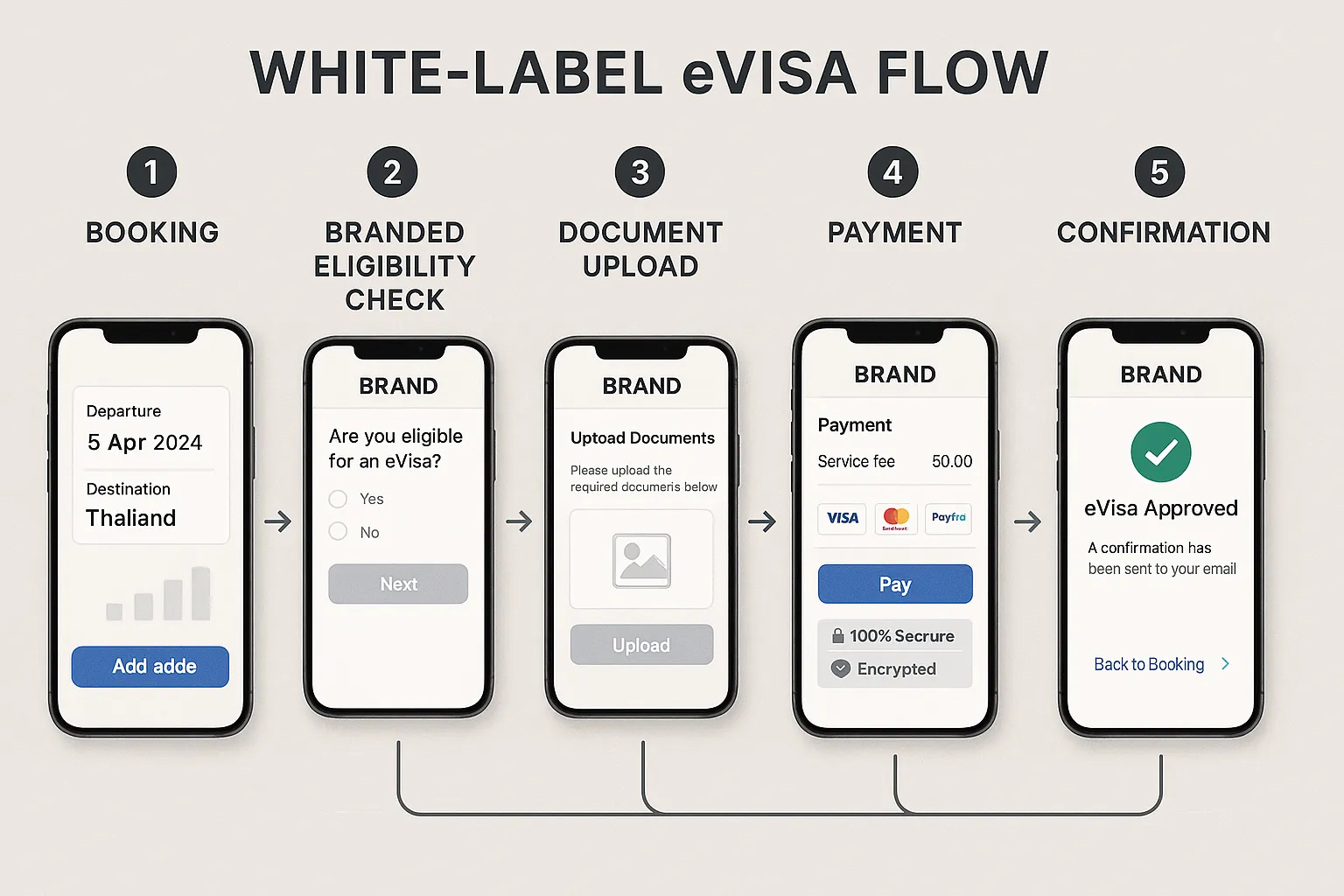
A white-label flow usually appears at one of two moments:
- Inline during the booking path (embedded widget or API)
- Post-booking via email/SMS links to a hosted portal
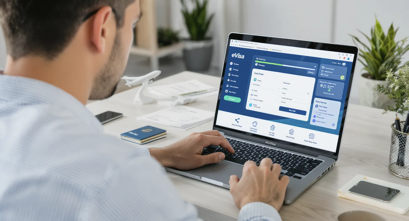
In both, the traveler assumes they are still dealing with your brand—even though the heavy lifting happens on SimpleVisa’s backend. Visual and micro-copy consistency reassure users that the process is official, safe, and worth finishing.
Conversion math: A 1-point increase in trust score (0–10 scale) correlates with a 5–7 % uplift in visa attach rate across 400+ SimpleVisa partner sites (internal dataset, Q1 2025).
2. Five Branding Do’s That Lift Conversion
Do 1 – Mirror Your Core Brand Palette, but Use It Strategically
- Apply primary colors to headers, buttons, and progress bars.
- Reserve secondary or neutral tones for body text to maintain readability.
- Keep contrast ratios WCAG-AA compliant (4.5:1 for normal text) to avoid accessibility fines.
Do 2 – Lead With Mobile-First Layouts
Over 72 % of eVisa applications on SimpleVisa are started on a phone. A responsive grid, large tap targets (48 × 48 px minimum), and sticky “Save & Continue” buttons halve thumb travel and cut drop-offs by 18 %.
Do 3 – Surface Trust Signals Early
Display security icons (ISO 27001, PCI-DSS, TLS 1.3 lock) and “Powered by SimpleVisa” micro-seal in the header or first fold. Nielsen Norman research shows security badges increase form completion by 11 % for financial-data steps.
Do 4 – Use Progressive Disclosure & Live Validation
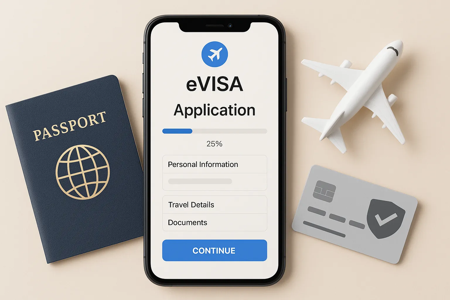
Break longer forms into 4–6 logical steps (Personal → Passport → Trip Details → Payment → Review).
- Show a step-indicator with completed ticks.
- Validate each field on blur; inline error text beats modal alerts for comprehension (Google UX Playbook, 2024).
Do 5 – Write Plain-English Micro-Copy
Replace bureaucratic jargon with concise prompts:
- ❌ “Surname as per travel document” → ✅ “Last name (exactly as on your passport)”
- Provide hover/tooltips for tricky fields (e.g., “Place of Issue”).
- State the total government fee upfront. Hidden costs destroy trust.
3. Six Design Don’ts That Kill Confidence
- Generic Default Styling – A plain white portal feels like a phishing site. Brand at least the header, footer, and primary CTA.
- Legal Walls of Text – Replace full T&Cs with a one-sentence summary and a link. Screen readers struggle with giant blocks.
- Pop-Ups & Cross-Sells Mid-Form – Upsell after confirmation, not during data entry.
- Inconsistent Date Formats – Force ISO (YYYY-MM-DD) or auto-localize to traveler locale; mismatches trigger errors.
- Excessive Document Requests – If SimpleVisa’s API can fetch a data point, don’t ask users to upload it again.
- Ignoring Accessibility – Lack of label-to-input links or missing alt text can expose you to ADA lawsuits and shut out a profitable customer segment.
4. The Branding-Conversion Scorecard
| UX Element | Best-Practice Metric | Industry Benchmark | Target for 2025 |
|---|---|---|---|
| Form Abandonment | % sessions that exit before payment | 45 – 60 % | < 35 % |
| Attach Rate | % bookings that add an eVisa | 7.6 % (global avg) | 10 %+ |
| Completion Time | Median minutes to submit | 13 min | ≤ 8 min |
| Mobile Share | % apps started on mobile | 72 % | 80 % |
| Accessibility Score (Lighthouse) | 0–100 | 85 | 95 |
Track these KPIs in your BI tool or pull them via the SimpleVisa Partner API. For deeper KPI advice, see our guide on 5 KPIs to Track After Deploying a Visa Management Platform.
5. Micro-UX Patterns That Pay Dividends
- Auto-OCR Passport Scans – SimpleVisa’s SDK pre-fills 35 % of fields, shaving two minutes off step one.
- Smart Defaults – Copy traveler contact data from the booking PNR when available.
- Reassurance Nudges – Show “99.3 % of travelers are approved” near the pay button (real SimpleVisa stat, 2025).
- Save & Resume Links – Email a magic link; 22 % of users return to finish later instead of abandoning.
Learn more in Why Travelers Abandon Visa Forms—and 6 UX Fixes That Convert.
6. Mini-Case Study: OTA X Lifts Visa Revenue 47 %
Problem – OTA X embedded an unbranded third-party visa iframe. Attach rate stalled at 5 % and CSAT dipped.
Fixes
- Applied brand colors + logo in header/footer.
- Added ISO 27001 & GDPR badges.
- Activated auto-OCR and progressive steps.
Results (90 days)
| Metric | Before | After |
|---|---|---|
| Attach Rate | 5.1 % | 9.4 % |
| Avg Completion Time | 11 min 42 s | 7 min 05 s |
| Visa-Related Support Tickets | 1 / 140 bookings | 1 / 280 bookings |
Source: shared by OTA X with permission, July 2025.
7. Implementation Checklist
- Map where the visa touchpoint appears in your funnel.
- Upload brand assets (logo, hex palette, favicon) in the SimpleVisa Partner Portal.
- Configure header/footer links back to your domain.
- Toggle trust-badge module and specify certifications.
- Set default locale, currency, and date format.
- Enable OCR and live-field validation.
- QA on low-end Android, iOS, and desktop.
- Launch A/B test: control vs. branded; run ≥ 14 days.
- Review KPIs and iterate copy or color contrast accordingly.
Need a technical crash course? Check out How to Offer White-Label Visa Services Without Writing Code.
8. Ready to Brand Your eVisa Flow the Right Way?
A polished white-label experience can unlock double-digit conversion gains—and SimpleVisa handles the heavy lifting behind the scenes. If you’d like tailored UX recommendations or a sandbox to test branding themes, book a 15-minute demo today and see how quickly you can launch a conversion-optimized, fully branded eVisa journey.
Travel made simple. Compliance made profitable.