Why Travelers Abandon Visa Forms—and 6 UX Fixes That Convert

The hidden leak in every booking engine
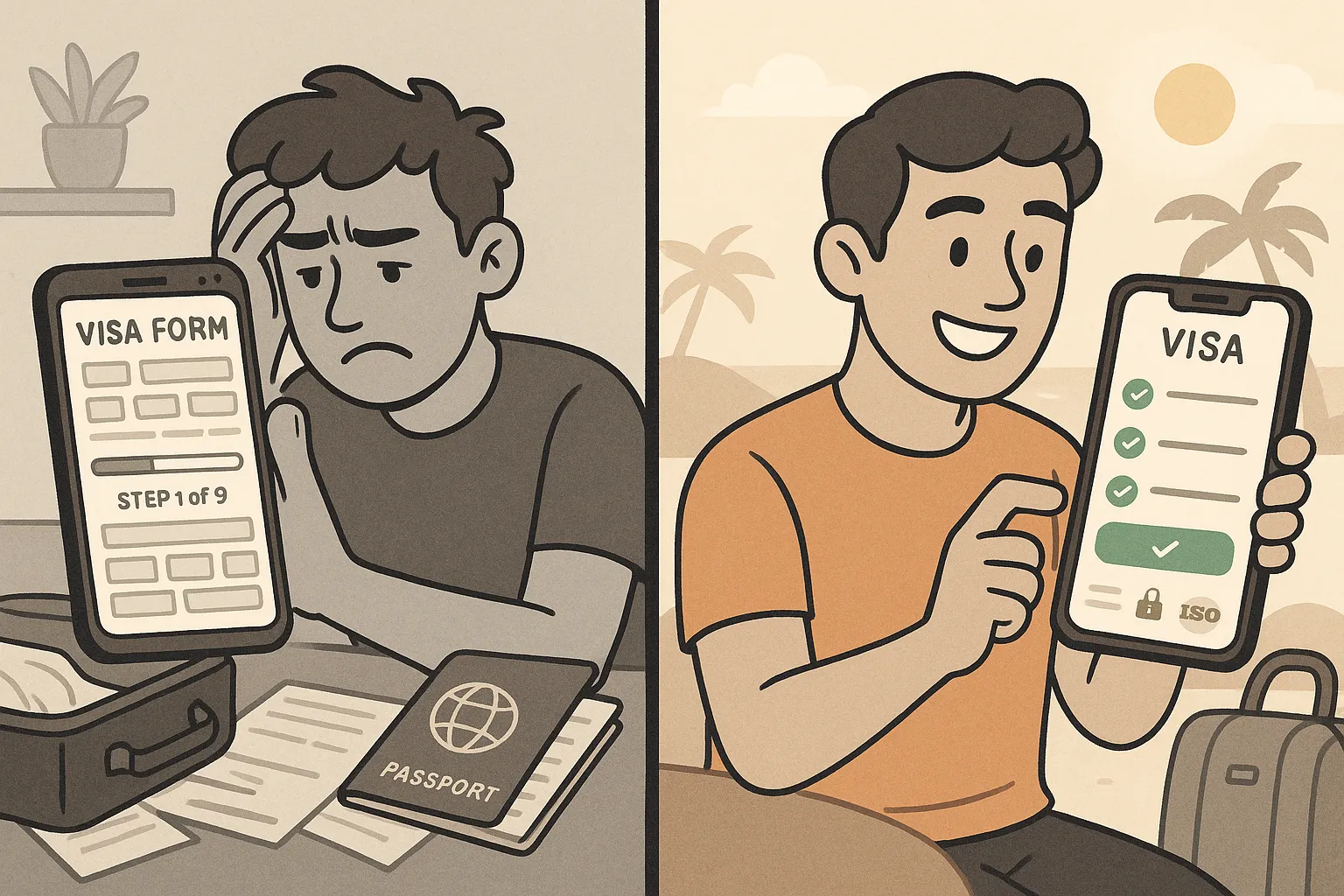
A traveler has chosen a destination, picked flights, and is already picturing that first cocktail on the beach. Then your site shows the visa form. Ten minutes later the tab is closed, the cart is empty—and another sale slips away.
According to Baymard Institute research, the average form-abandonment rate sits above 67 %. For long, multi-step travel documents it climbs past 80 %. With visa fees often clocking in at $25–$120, every abandoned form is lost ancillary revenue and a frustrated customer who may not return.
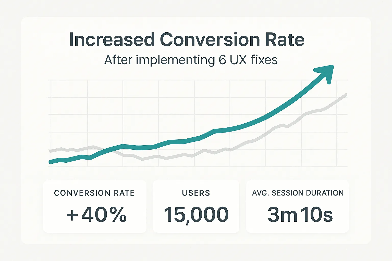
Why do travelers flee, and how can you reel them back in? After analysing more than 2 million sessions across airline, OTA, and tour-operator sites that use SimpleVisa, we found six recurring friction points—and six UX fixes that lift conversion by up to 42 %.
Why travelers abandon visa forms
-
Form length anxiety
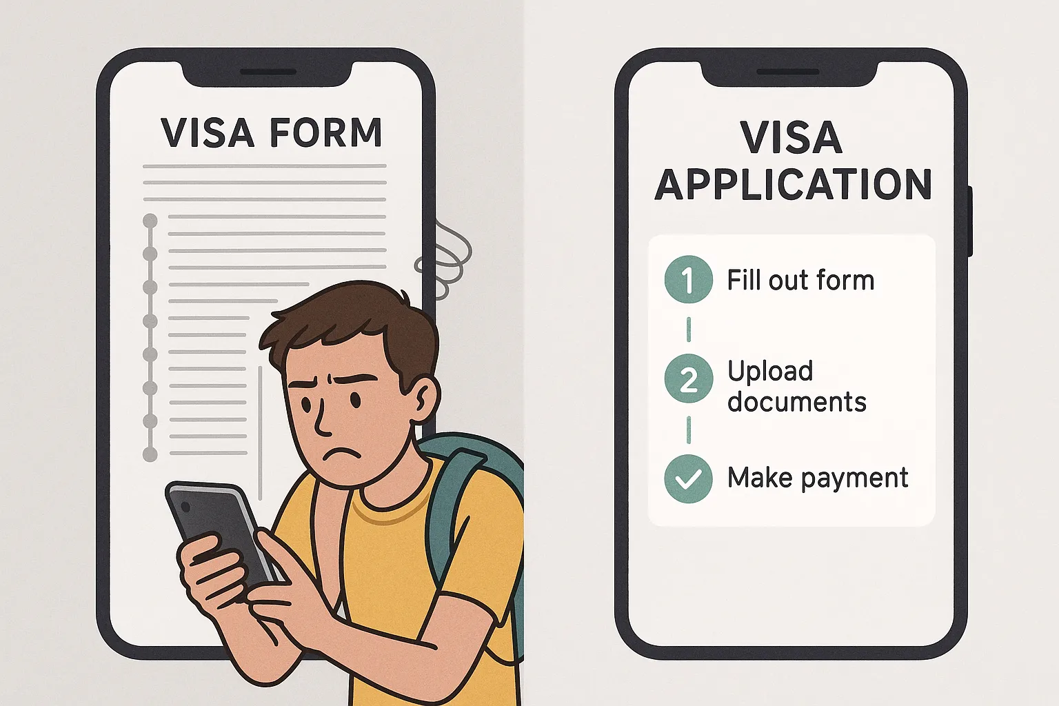
Seeing a progress bar stuck at “Step 1 of 9” immediately raises blood pressure—especially on a phone. -
Legalese & government jargon
Terms like issuing authority or alien registration number mean little to most holidaymakers. -
Surprise document requests
A last-minute demand for a 512 KB passport photo or hotel voucher sends users scrambling—and often quitting. -
Hidden fees & currency shocks
Quoting the visa price only at the final step (or in an unfamiliar currency) erodes trust. -
Security fears
Uploading a passport and credit-card details on an unknown domain triggers second thoughts. -
Clunky mobile experience
68 % of SimpleVisa sessions now start on a phone, yet many legacy forms are still desktop replicas crammed into a small screen.
6 UX fixes that convert
1. Break the form into bite-size, dynamic steps
Instead of a monolithic questionnaire, use progressive disclosure: ask only what’s needed for the next API call, then hide irrelevant fields. Travelers applying for a single-entry tourist eVisa don’t need to see work-permit questions.
Impact: Airlines that switched to a dynamic flow with SimpleVisa’s Smart Blocks saw a 27 % reduction in time-to-complete and a 19 % drop in abandonment.
2. Swap jargon for human language (and inline help)
Replace “Passport date of issue” with “When was your passport issued?” and add tooltips or micro-copy under tricky fields. A/B tests show that adding an inline example (DD/MM/YYYY) next to the date field cuts validation errors by half.
Need inspiration? The How to Apply for an Electronic Visa guide is loaded with plain-language phrasing you can borrow.
3. Offer instant document capture & cloud storage
Nothing kills momentum like hunting for a scanner. Bake in a mobile document scanner that auto-crops passports and selfies, compresses them to the required KB, and stores them securely for the traveler’s next trip.
Pro tip: With SimpleVisa’s SDK, returning users automatically fetch previously verified documents—repeat-trip completions jump by 30 %.
4. Show total cost early—and in the user’s currency
An upfront price summary (visa fee + service fee + optional priority processing) removes sticker shock. Display it in the currency the traveler used to pay for the flight, and clearly label any government components.
If currency conversion is needed, link to the live rate source (e.g., XE.com) so users feel informed rather than blindsided.
5. Display trust signals at the point of doubt
When the form requests sensitive data, anchor trust:
- SSL badge and ISO 27001 logo next to the upload button
- One-click access to your privacy policy
- A note that SimpleVisa processes more than 1 M visas yearly with a 98 % approval rate
Need more reassurance factors? Our article on How Secure is the Electronic Visa System? outlines additional certifications you can highlight.
6. Design for thumbs first, not mice
Mobile users abandon twice as often when they must pinch-zoom. Adopt these mobile-first patterns:
- Large, swipeable input selectors instead of drop-downs
- Automatic numeric keyboards for passport numbers
- Sticky progress footer with next/previous buttons positioned within thumb reach
Embedding the SimpleVisa widget—which is built on a responsive, PWA-ready framework—can be done with one line of code or via our no-code iframe for CMS-driven sites.

Real-world results
• Low-cost carrier in APAC replaced its legacy PDF upload with the SimpleVisa API. Conversion on ancillary visa sales climbed from 13 % to 31 %, adding $3.2 M in annual revenue.
• European OTA introduced upfront pricing in local currency and cut abandonment on the payment step by 38 %.
• Luxury tour operator enabled document re-use for repeat guests; average completion time dropped from 11 min 20 s to 6 min 5 s.

Implementation checklist
- Audit your existing form: Record a session on mobile and list every friction point.
- Prioritize quick wins: Plain language and upfront pricing usually require only copy changes.
- Embed Smart Blocks: Use SimpleVisa’s pre-built components for dynamic flows and document capture.
- Add trust markers at all data-sensitive steps.
- Run A/B tests: Measure abandonment, time-to-complete, and support tickets.
- Iterate monthly: Visa rules change; so should your micro-copy and validation logic.
For a deeper dive into tech integration, visit How eVisa APIs work: Step by Step.
Stop leaking revenue—start converting
Every abandoned visa form isn’t just lost fee income; it’s a frustrated traveler and potential churn. By tackling the six friction points with targeted UX upgrades, you can transform a dreaded chore into a value-adding, revenue-generating step of the booking journey.
Want to see how the fixes look in your own flow? Request a live demo and we’ll plug your booking path into SimpleVisa’s sandbox in under 24 hours.
Travel should be simple. So should visas.